Building a beauty brand's boldest digital chapter yet.

WHERE
CASE Agency
ROLE
Lead UX Designer
CONTEXT
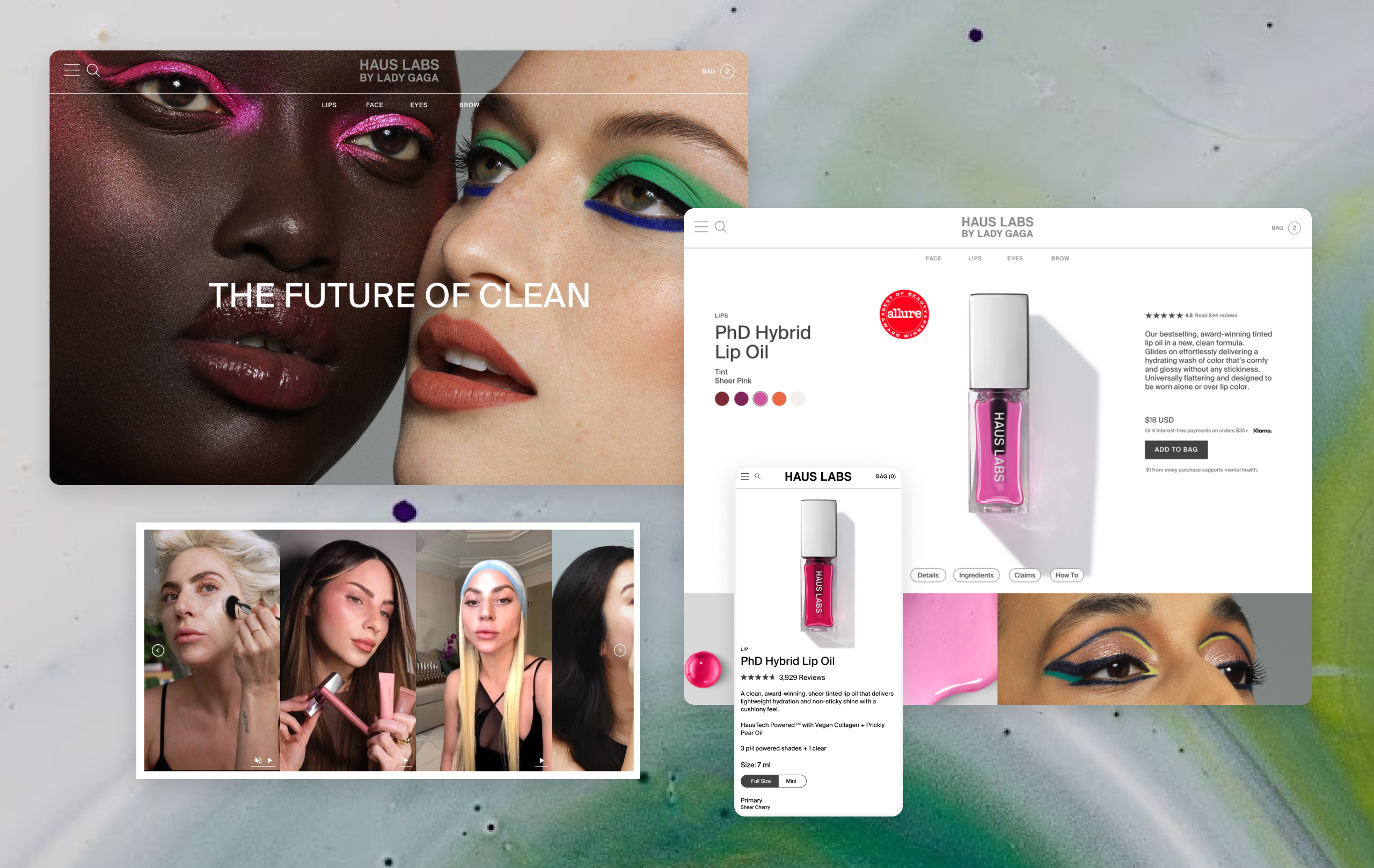
Haus Labs launched as Lady Gaga's beauty brand with a clear point of view: makeup as a vehicle for self-expression, powered by serious science. By the time CASE Agency came on board, the brand was in active expansion — growing its product line, elevating its formulation story, and investing in photography and creative that reflected a more mature brand identity.
The redesign wasn't about fixing what was broken. It was about building a digital experience that could hold the full weight of what Haus Labs was becoming — a brand where art, science, and community weren't just marketing pillars but the actual architecture of how customers needed to move through the site.
PROBLEM
A growing beauty catalog creates a specific UX problem: the more products you add, the harder discovery becomes — especially when the brand's differentiation lives in formulation detail and ingredient science that most beauty sites bury in fine print.
The challenge was to design an experience where education wasn't a separate destination but an integrated part of the shopping journey. A customer shouldn't have to choose between browsing products and understanding what made them different. The science needed to be present at every touchpoint — not as a detour, but as a conversion driver.
MY ROLE AND CONSTRAINTS
I served as UX Design Lead, working as a senior IC embedded within the CASE Agency team. I owned the site architecture, user flows, and experience strategy, collaborating with CASE's strategy, research, digital, and project management teams to develop and align on the approach before presenting to the Haus Labs team for approval.
The three approved site themes: Art (next-gen artistry), Science (product-first, ingredient-led storytelling), and Kindness (community as the living voice of the brand), which shaped every structural decision I made. My job was to translate those brand pillars into an experience architecture that a customer could actually navigate seamlessly.
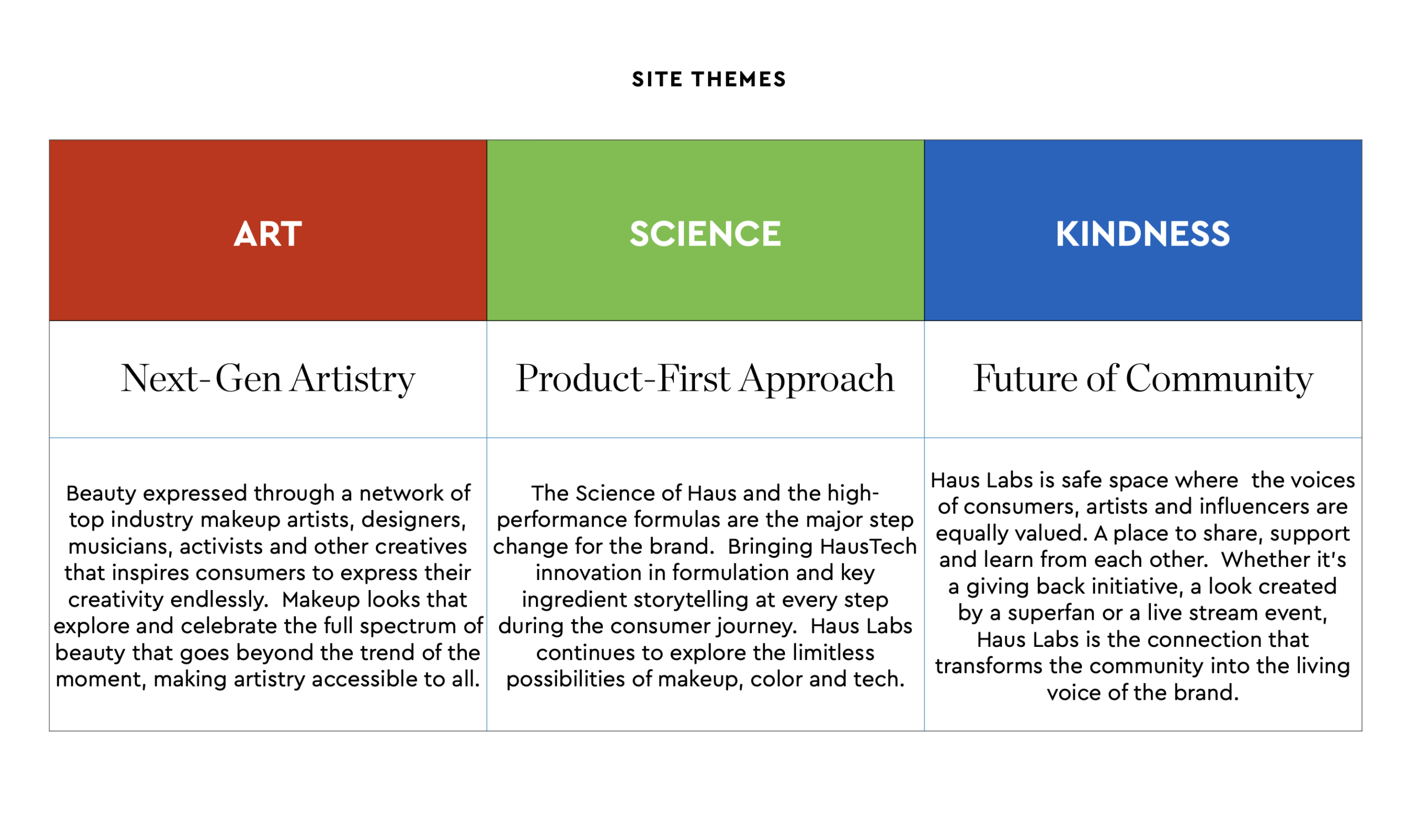
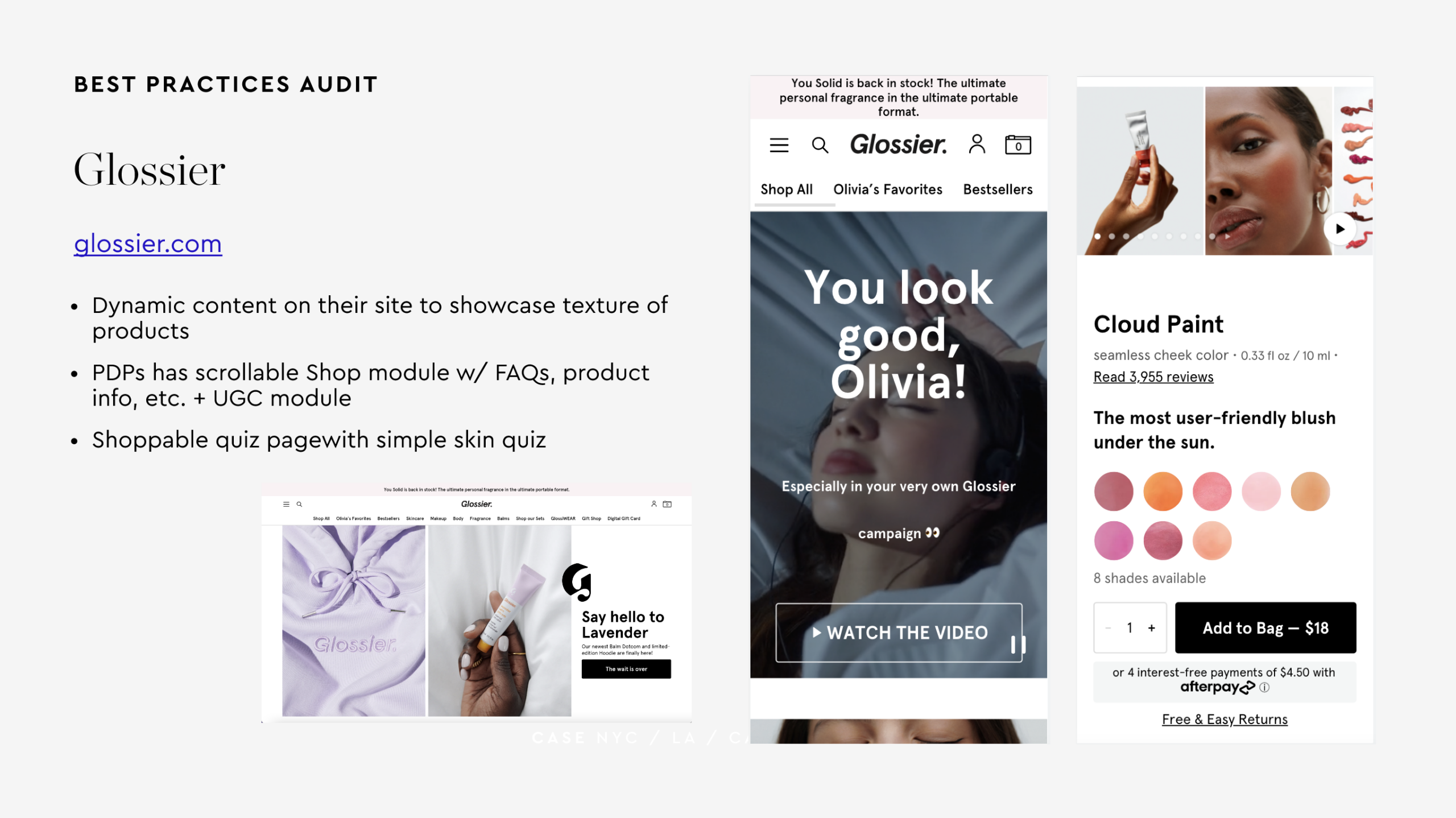
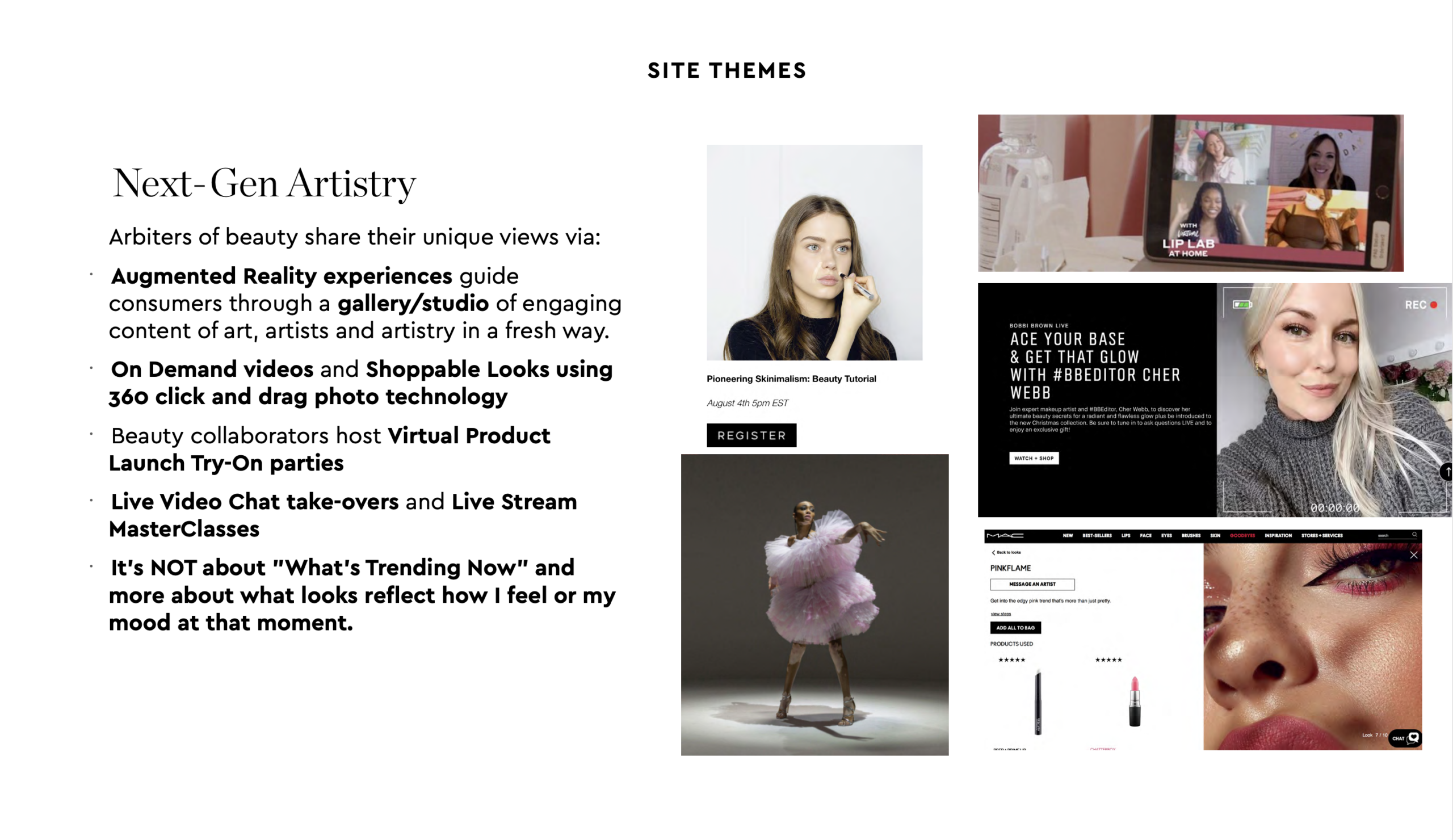
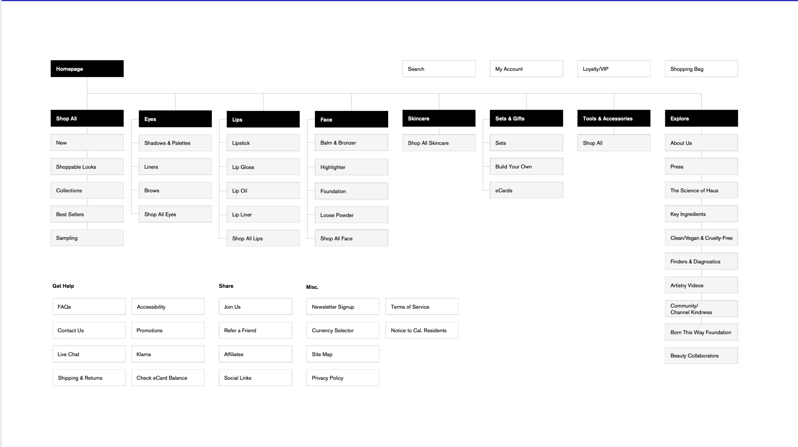
Competitive Analysis, Site Theme Strategy Expansion, and Site Map
KEY DECISIONS
Based on the company's site themes, I made key decisions on the path for the site flow and wireframes. These are a few highlights of the pivotal moments of the project.
KEY DECISION 1
Treating science as a key navigation layer
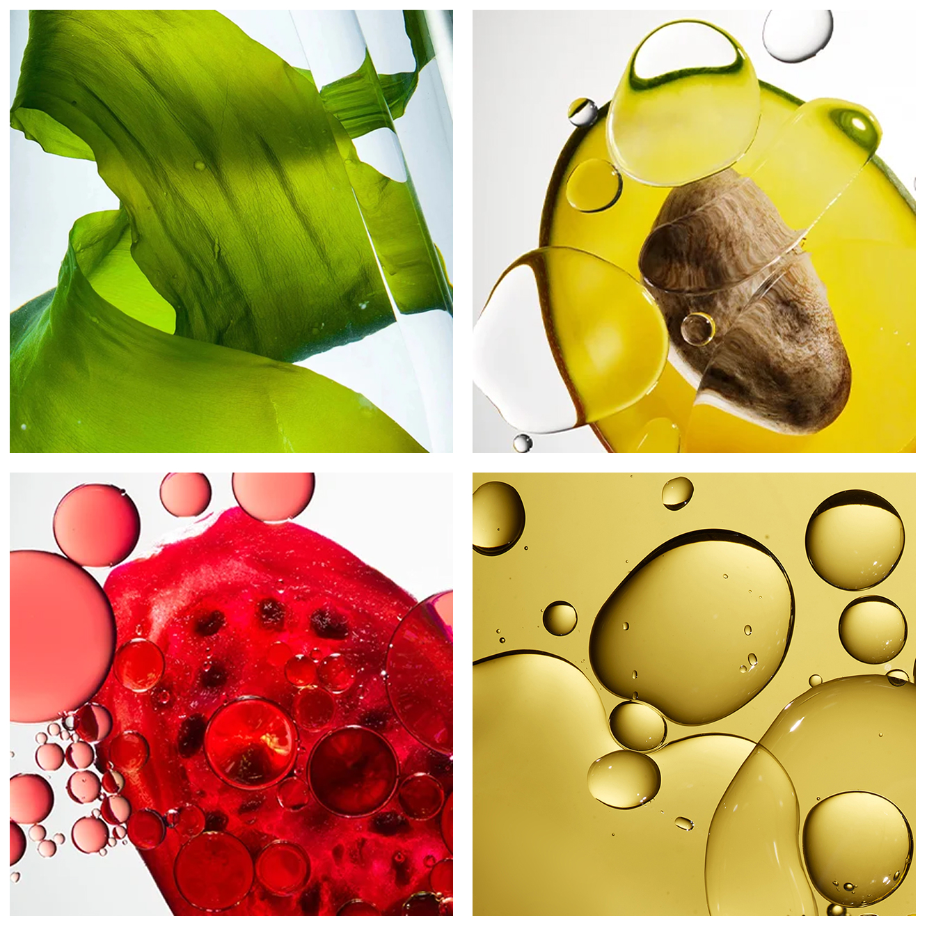
Most beauty brands with a science story put it in an "About" or "Ingredients" section that customers never find. I advocated for integrating ingredient and formulation storytelling directly into the product discovery flow — so that a customer browsing foundation was encountering the HausTech innovation story in context, not as a separate destination.
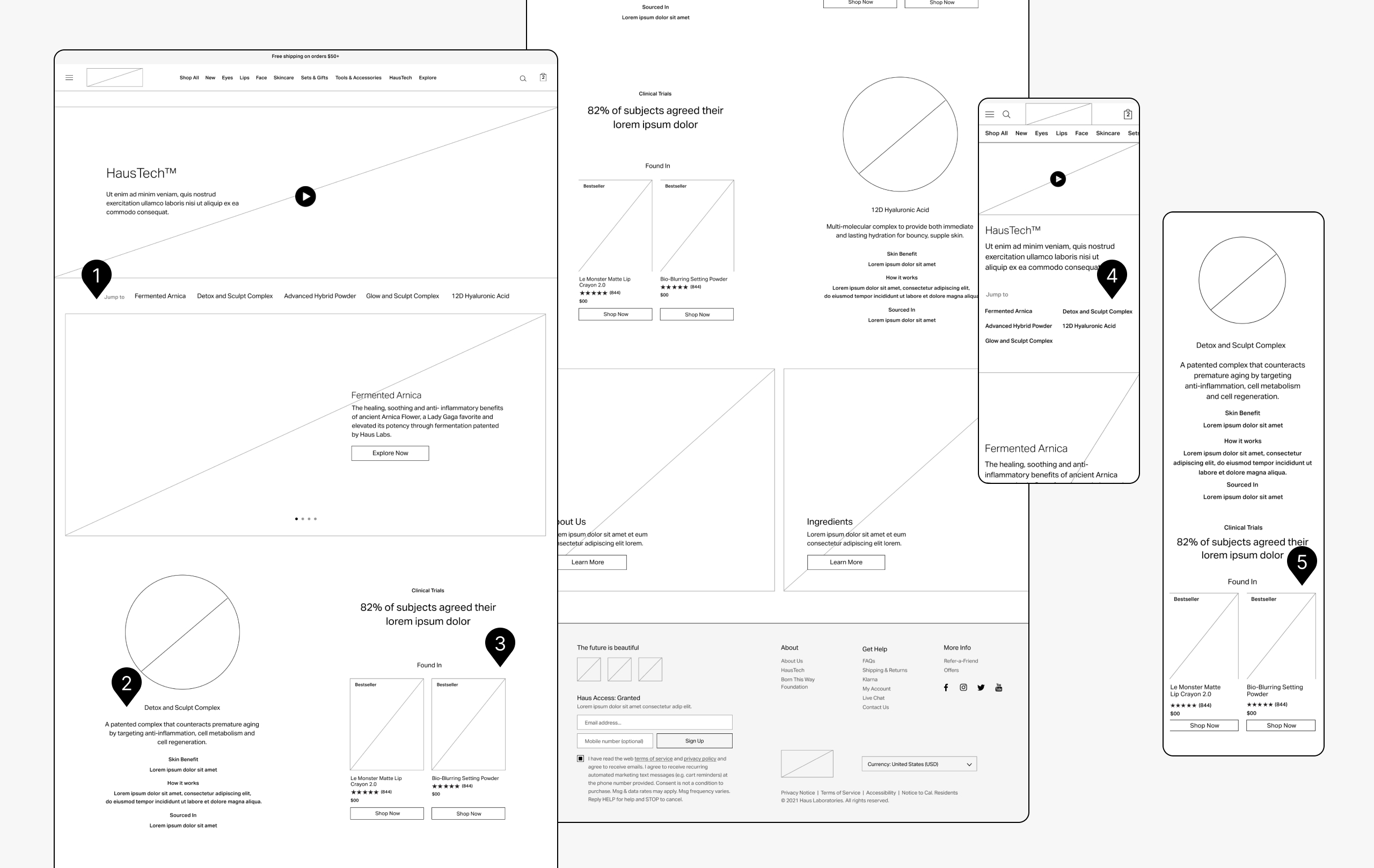
FIG. 1
This page was intended for lengthy storytelling about HausTech, the science behind the ingredients. It was crucial to have a simple, elegant navigation to help navigate through the content.
FIG. 2
Each ingredient got a spotlight on this page. Alongside benefits, clinical trial results, and the products, the education side of this page was a key business objective, and we wanted deep storytelling to prevail here.
FIG. 3. + 5
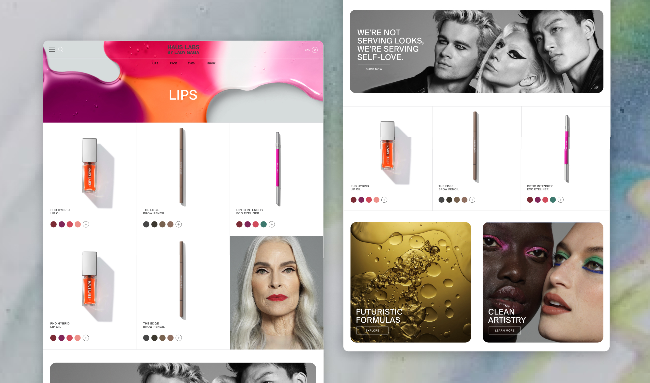
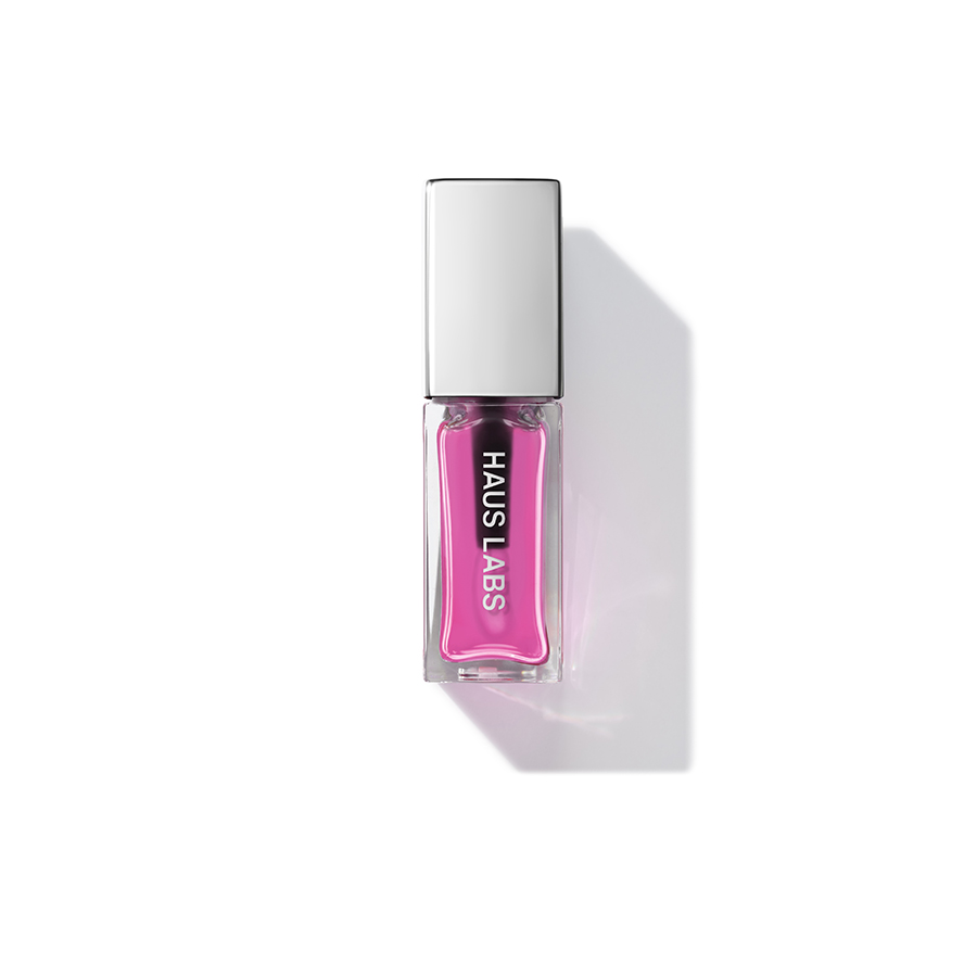
In our competitive analysis, we found that while ingredient pages lived on site, it was often not tied to directly to the products. We brought in a product carousel to shop the ingredients directly on the page. This small touch elevates the product science rather than only ingredients.
FIG. 4
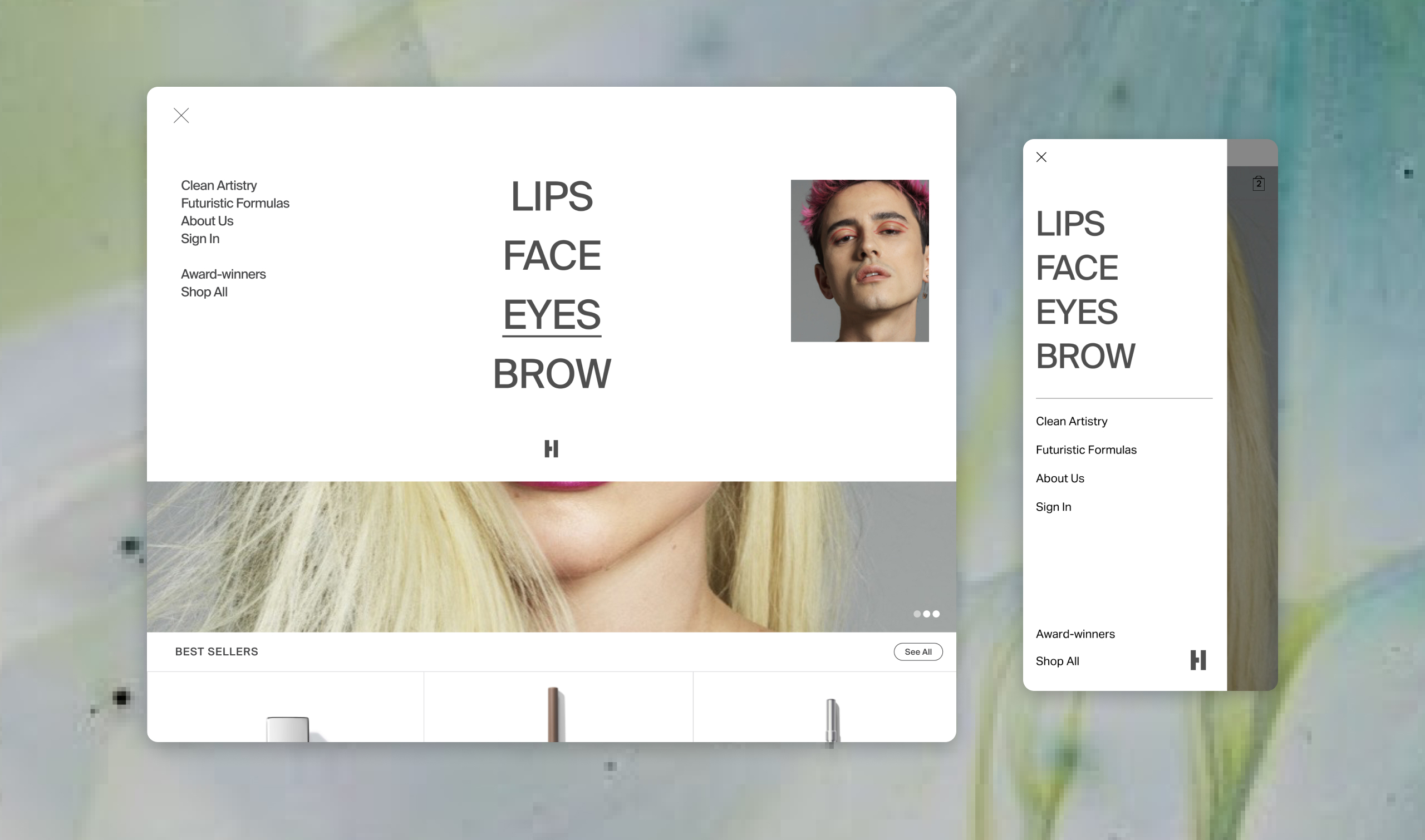
On mobile, we ran into issues with too many carousels on a page. We opted for a stacked navigation so all ingredients could be viewed in one screen. While this space was important on mobile, we felt the ingredient names up front was again matching back to the science-forward business goals.
KEY DECISION 2
Designing for an expanding catalog
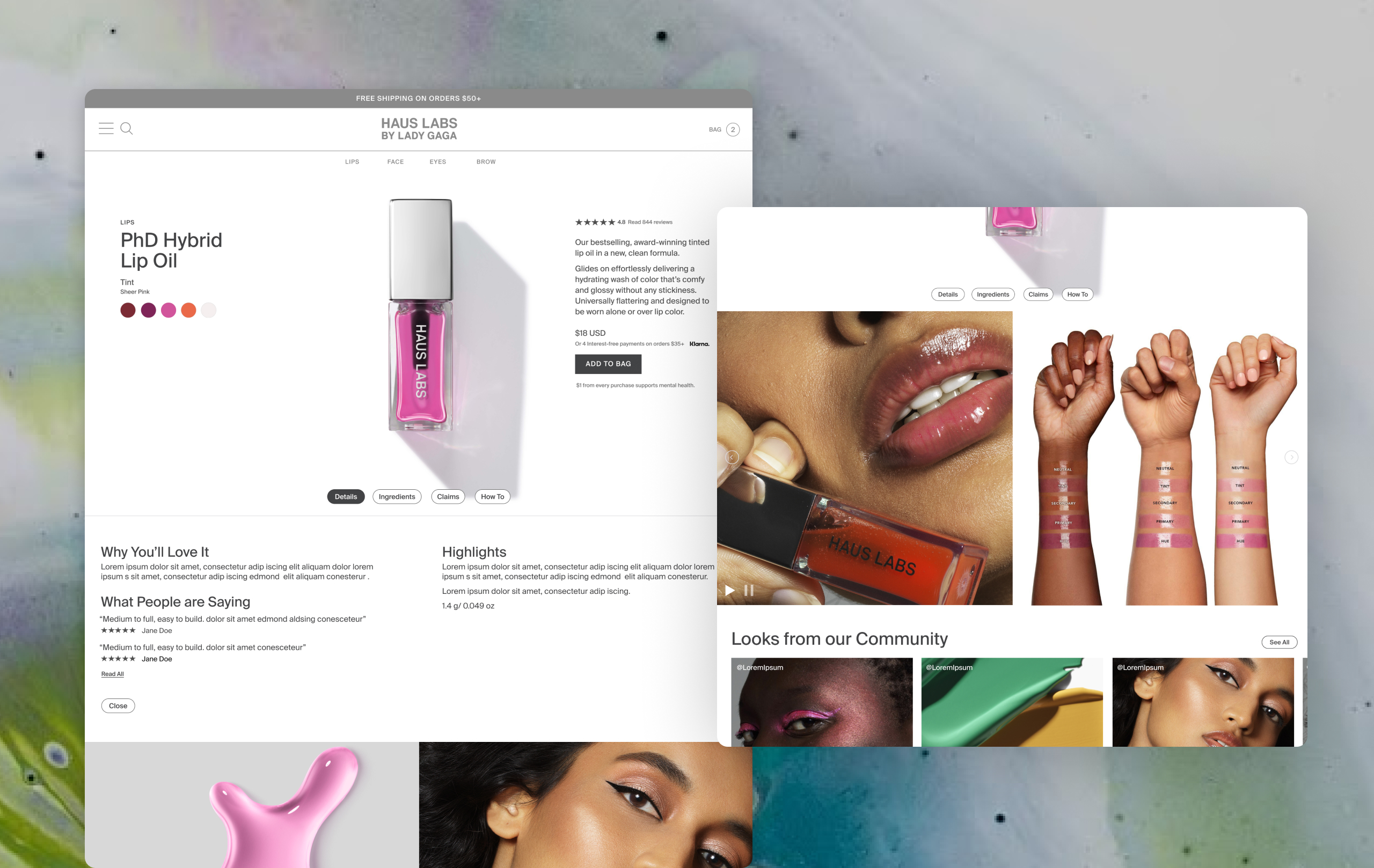
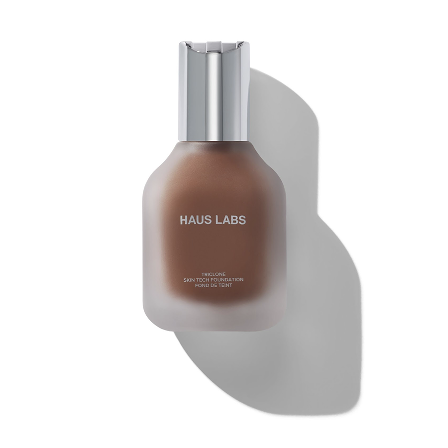
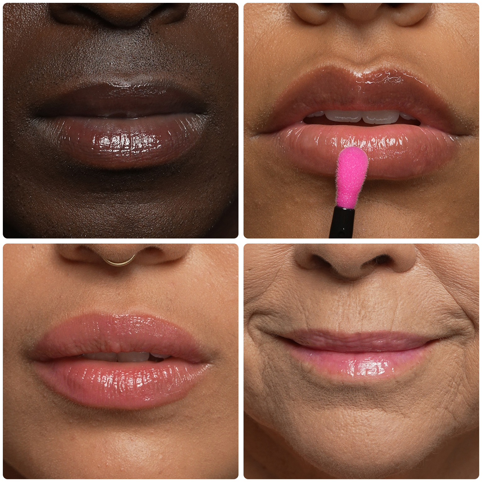
Haus Labs is known for its inclusive colorways, and with the redesign, they were planning to launch an even bigger SKU count. The problem arose in navigating all the shades and finding the perfect match for your skin tone. Our problem to solve because easy PDP navigation as well as a Skintone Match flow to assist users in this journey and reduce return rates.
To add to the complexity, we added a try-on feature to test the foundations. This layer needed to be highlighted alongside
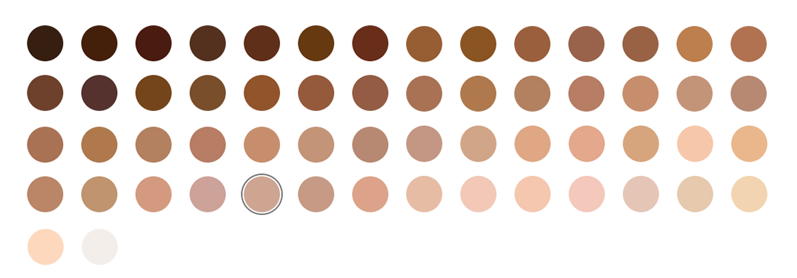
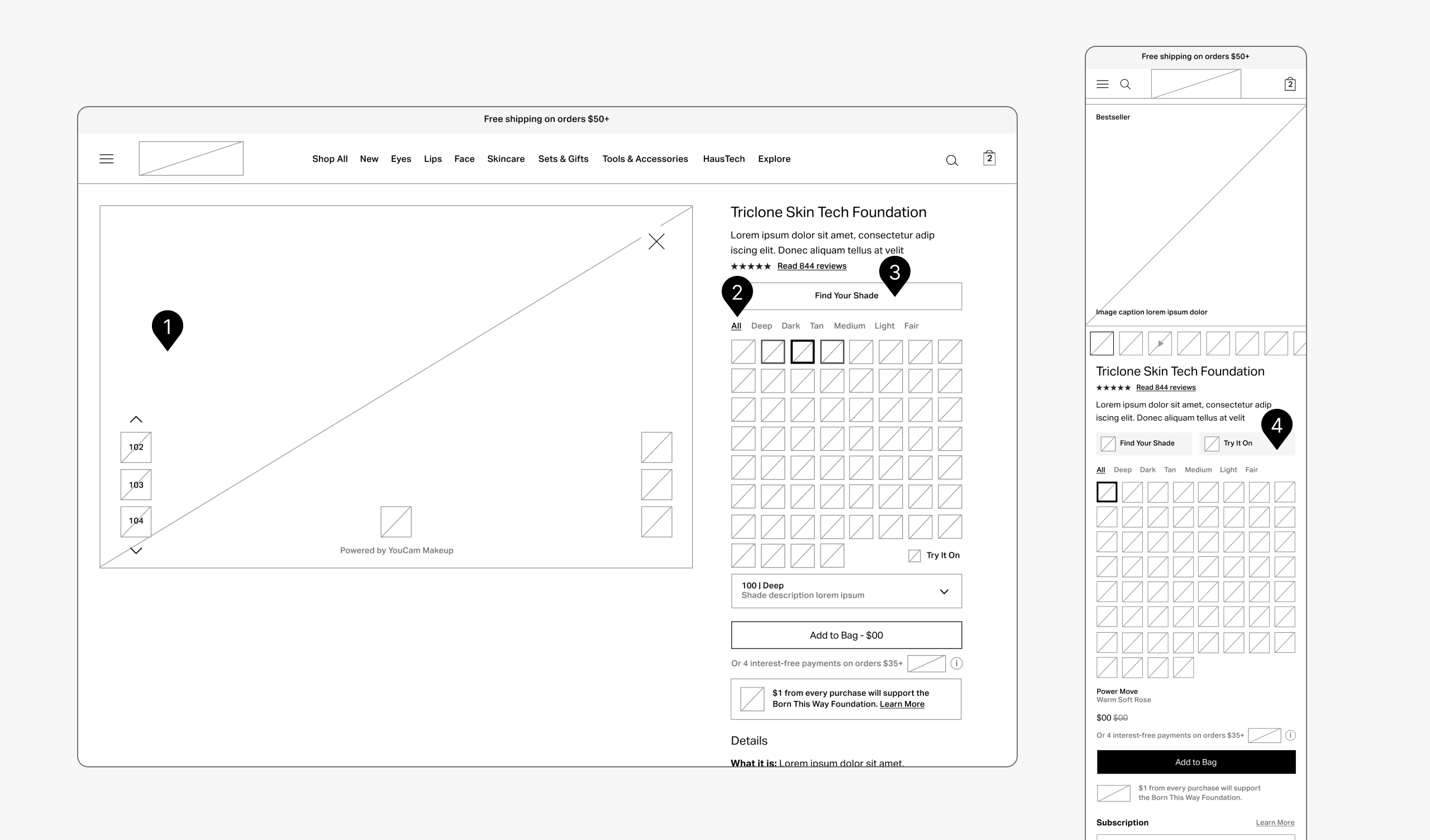
FIG. 1
We looked at how the colors would translate to the Virtual Try On. By adding a slider on the left side of the screen, the user could easily scroll lighter or darker based on their first shade selection.
FIG. 2
We felt a sorting option could help navigate the sheer amount of options, but landing on the breadth of options was important. By grouping by tones first, this could help the user funnel options down quickly while still experiencing the breadth of options available to them.
FIG. 3
We wanted the Find Your Shade button front and center to elevate the customized experience for the user. We felt is more important than surfacing the Add To Bag button due to our goal of selecting the right shade and lowering return rates.
FIG. 4
Placement of the Try It On button was an issue. We had many competing priorities for the page: Find Your Shade, Color Selection, Add to Bag, Klarna messaging, and Subscription options. The feature was later removed and we focused on the shade finder process due to much better results in finding the correct shade.
KEY DECISION 3
Balancing the community pillar with the commerce experience
The Kindness theme — community as the brand's living voice — was strategically important but architecturally tricky. I structured the community layer to support and extend the commerce journey rather than divert from it, so a customer encountering a superfan look or a live stream moment was being pulled deeper into the brand, not away from the cart.
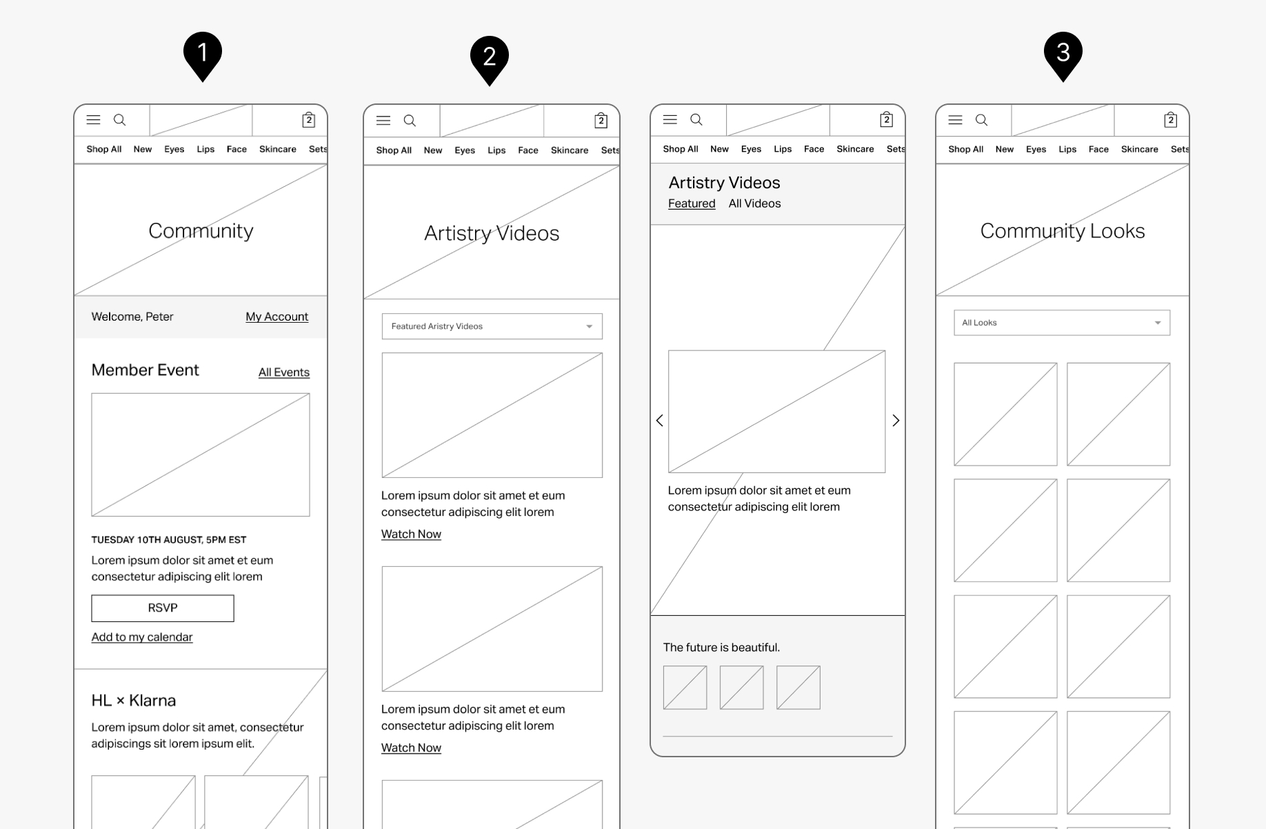
FIG. 1
We built a Community landing page, as part of the company initiative for member events, video content and resources could live as a community on the site. This dashboard became the landing for the community and acted as a central hub.
FIG. 2
Next-Gen Artistry was another key business goal and building a video archive of both professional and user-generated content was part of the goal to bring everyone into one space. The user could sort by style, theme, artist or simply watch and scroll.
FIG. 3
While the Artistry page held videos and tutorials, the community looks were meant to inspire creators and the community at large to share how they were using Haus Labs makeup.
THE COMMUNITY PIVOT
We found that in implementation, the community living on site didn't allow for users to organically find the brand. Social channels were still found to bring together a deeper breadth of community and organic growth.
The pages pivoted to house reviews and video tutorials from Lady Gaga and the community, and turned into richer content on PDPs and in-line content for PLPs. This allowed for deeper storytelling and also built out organic reach from social platforms to find the brand.
THE OUTCOME
The Haus Labs redesign launched alongside the brand's expanded product line and elevated creative direction, establishing the digital foundation for a brand in active growth.
The site architecture was built to scale with the catalog, support ongoing ingredient education, and hold the community experience as a first-class part of the brand. Haus Labs received significant press attention around the rebrand and product expansion launch.