Transforming a heritage brand's first real digital bet.
PROJECT TYPE
Site Redesign
BRAND
David Yurman
ROLE
Lead UX Designer
CONTEXT
David Yurman had been a jewelry icon for 45 years. Its digital presence hadn't kept pace. The site had grown incrementally without a unified vision — pages built at different times, to different standards, with no shared design language and no clear north star for what a David Yurman digital experience should feel like.
The business was ready to change that. With ecommerce becoming a primary growth lever, leadership made the decision to invest seriously in the site for the first time — not just refreshing individual pages, but setting the foundation for how the brand would live digitally for the next decade. The redesign wasn't a facelift. It was the beginning of a real digital product strategy.
Outcome & Metrics
Site health metrics improved significantly following Design System implementation:
-38%
Bounce Rate Reduction
+55%
Time On Site Increase
+9%
Page View Increase
80
ADA compliance score, the highest number the team has seen
THE PROBLEM
The central tension of this project was one of competing imperatives. Luxury brands are traditionally restrained — they prioritize aesthetics over conversion, storytelling over transaction, editorial over ecommerce. But a site that doesn't convert isn't serving the business, and a site that feels like a generic shopping experience isn't serving the brand.
The design challenge was to build something that did both: a frictionless, high-converting ecommerce experience that also felt unmistakably David Yurman — elevated, considered, and worthy of a customer who could walk into a flagship on Fifth Avenue instead.
The additional complexity: we were redesigning a live site page by page, building a design system in parallel, with no ability to take the site offline and no margin for inconsistency between what was already live and what was coming next.
MY ROLE & CONSTRAINTS
I led the end-to-end UX design of the redesign, from setting initial direction through execution.
I worked through stakeholder alignment, launch, and presented directly to Evan Yurman and C-suite leadership. I worked closely with Creative to establish the typographic and color foundation, then led all interaction design, information architecture, and user experience decisions from there.
The constraint that shaped everything: we were designing ahead. Every page decision had downstream consequences for pages not yet designed and for a design system being built in tandem. I had to think ten steps ahead on every component, every pattern, every interaction, to ensure that what we built for the homepage would scale cleanly to the PLP, the PDP, the cart, and beyond.
THE SETUP
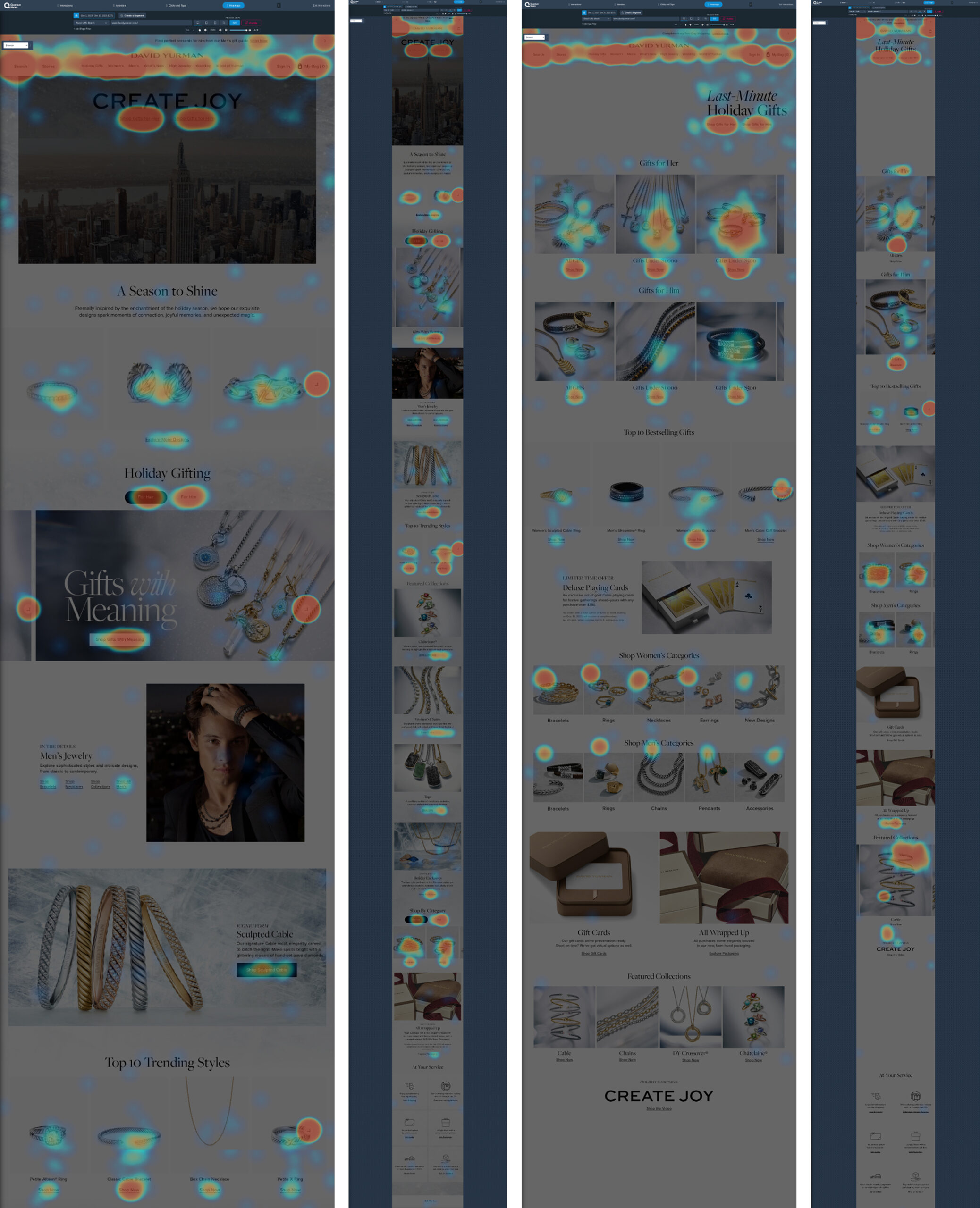
Data played a crucial role in understanding where the site was working and not working to then create a plan for the redesign. The issue became that we had limited data to work with. Data only went back 1 year, so we needed to rely on UserTesting and competitive analysis to get us the rest of the way.
THE PROCESS
The redesign included a global navigation redesign, a Homepage module template reimagining, 12 core templates, net new pages, an entirely new FAQ Hub, My Account Redesign, built in new ADA compliance, and took place in a phased rollout over a span of 14 months, all while developing the foundation for the Design System.
To say the project was large is an understatement! We faced challenges and wins in every single page we designed, but sharing the entire journey would take days to read through.
I've highlighted some of the biggest challenges and wins of the project below.
PAGES REDESIGNED
Global Navigation
Homepage
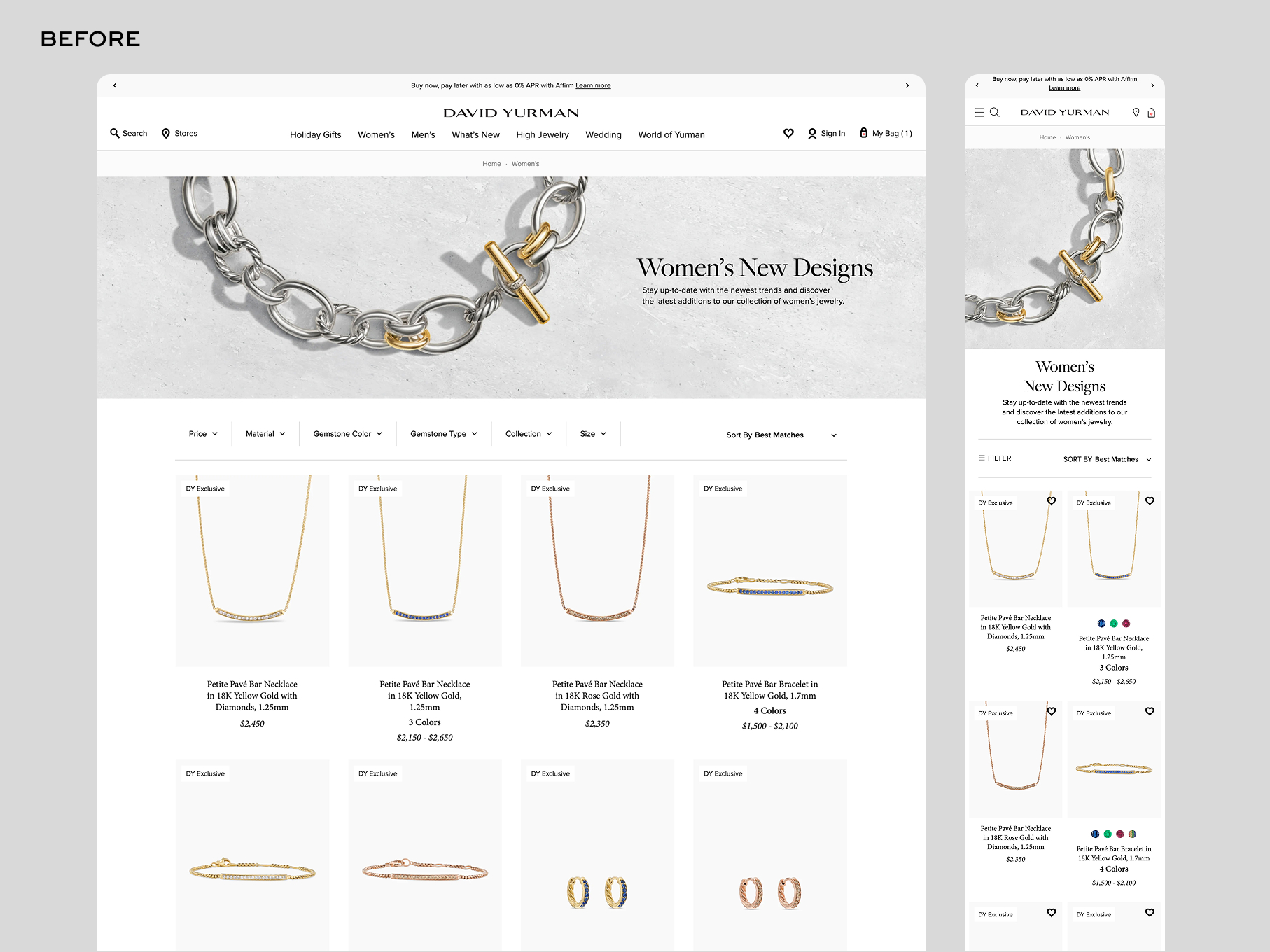
PLP
Women's, Men's, Gift's LPs
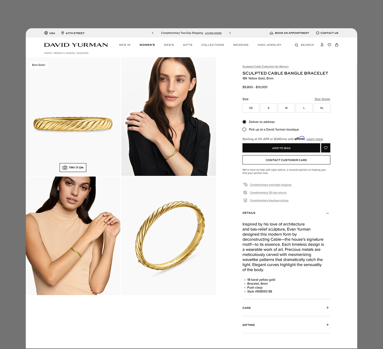
PDP (updated)
Store Locator
Mini Bag & Cart
Search
FAQs Hub
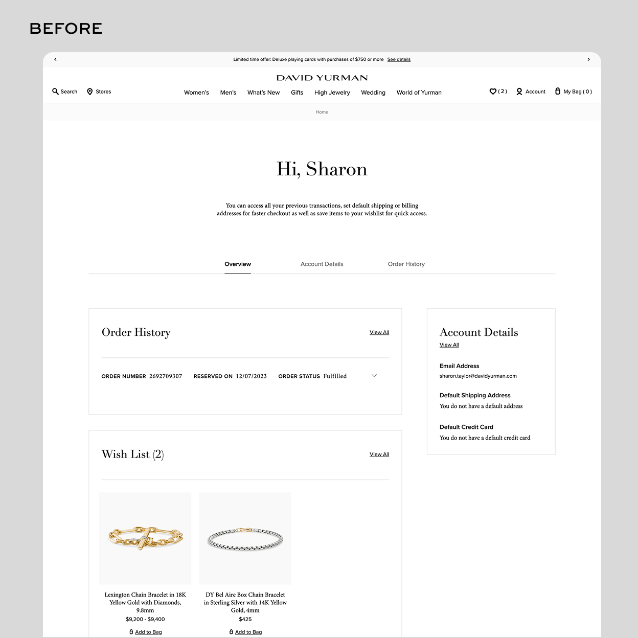
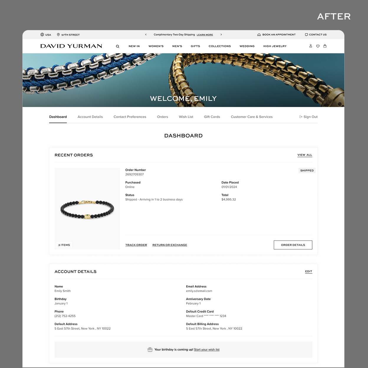
My Account
Wish List
Privacy Policy & All Legal Pages
Content Hub (Net New)
CHALLENGE 1
Reimagining the Site Architecture and Global Navigation
Rather than redesigning pages in isolation, I worked with Creative to lock a visual baseline: type system, color usage, spacing logic, and component behavior, before significant page work began. This gave every subsequent decision a shared reference point and prevented the fragmentation that had defined the old site. It also meant the design system work and the redesign work were informing each other in real time, which required discipline but produced a more coherent result.
CHALLENGE 2
Creating a flexible and reusable system for the Homepage
One of the biggest challenges for the Homepage was a desire for flexibility from the Creative team, but often ADA standards and brand standards became grey as they flexed beautiful designs. The pages also needed additional development and would become bottlenecked on bandwidth for major holidays, some of the biggest revenue drivers for the site.
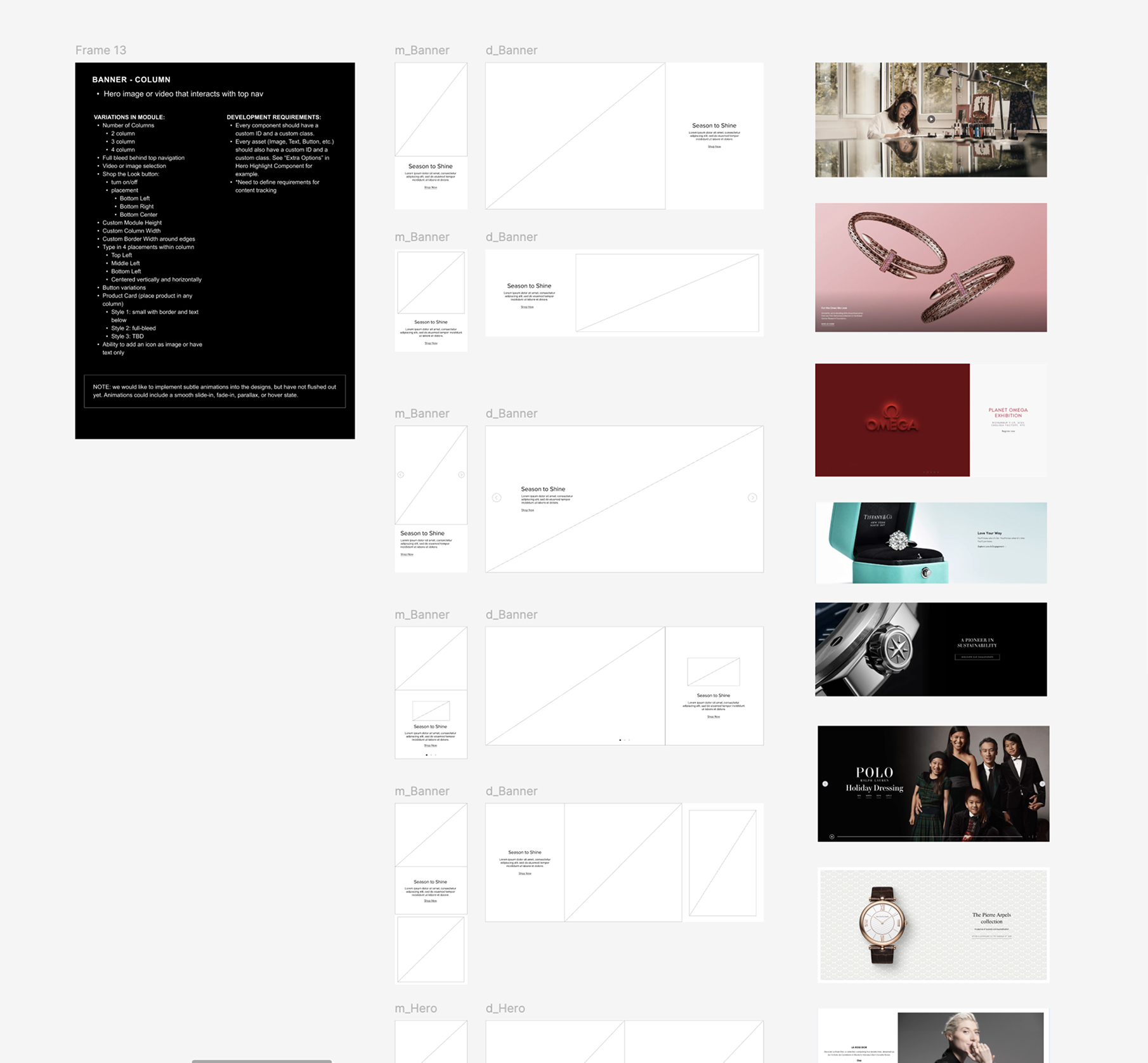
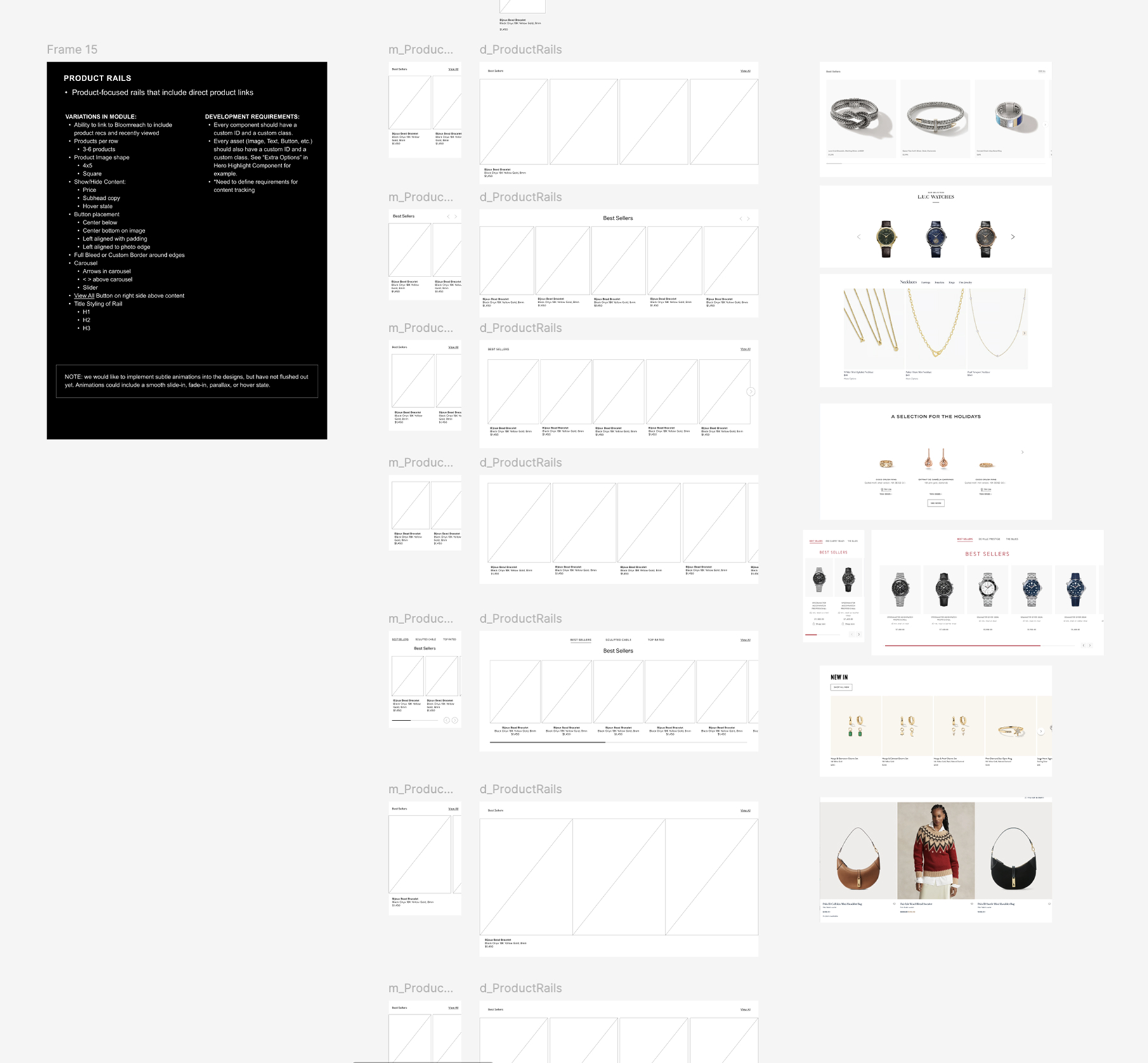
We set out to create a module system that could create repeatable, yet flexible, modules for content, saving time on development and adding more creativity to the Homepage.
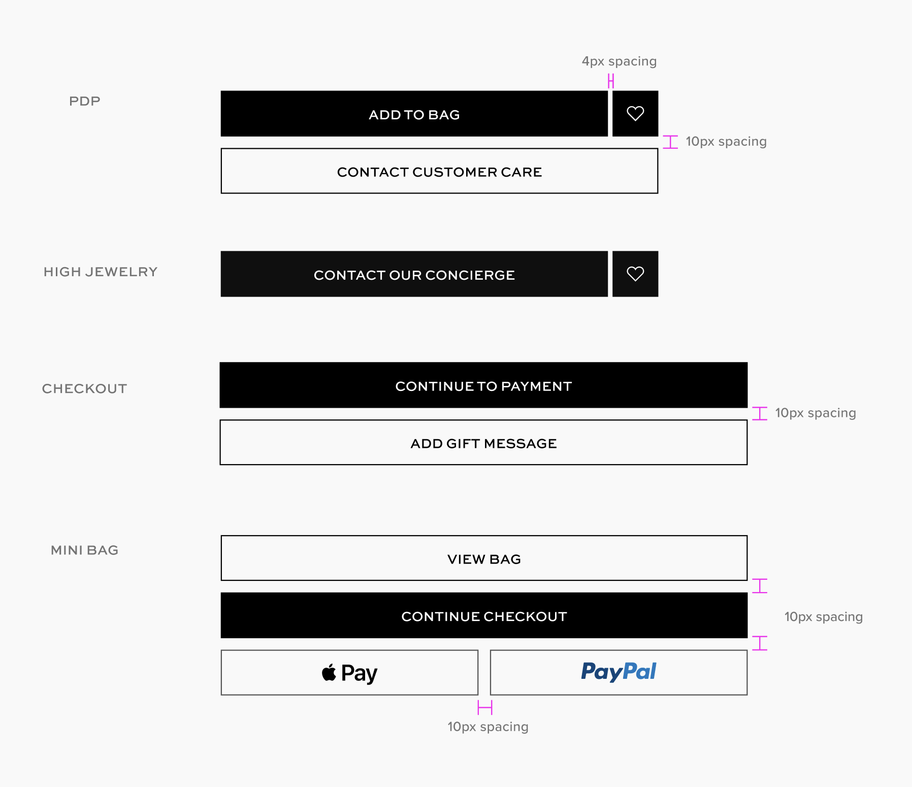
We pitched the Pre-Designed Modules to leadership and they approved. We began developing the designs and wiring out scenarios, partnering with the Creative team to understand what kind of designs they needed most and how they should flex.
However, as we worked with the Dev team, we realized we could give even more "freedom with boundaries" as we liked to call it, and pitched a new update: using a flexible container to house the components. This allowed us to group infinite amounts of pre-set modules together, giving Creative more room to create and also staying with the Design System standards. It was a win-win.
We re-aligned the approach with leadership and after approval, we were off to the races.
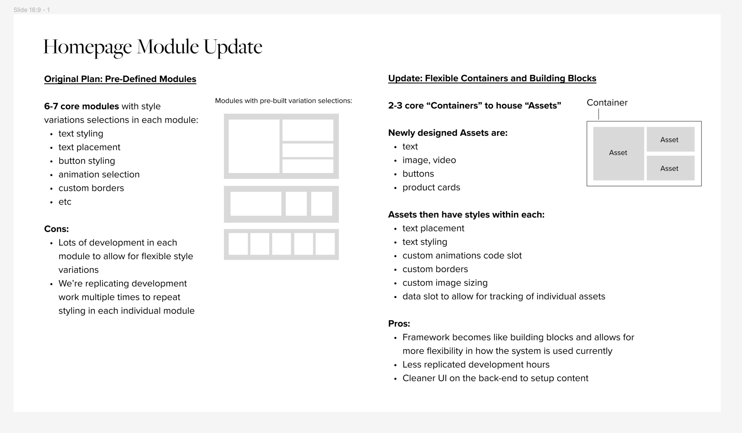
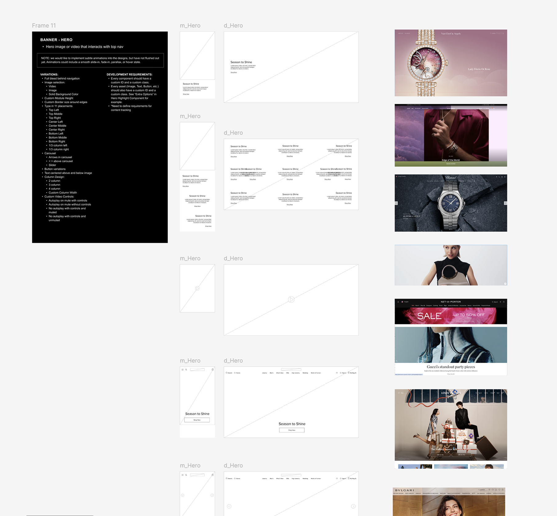
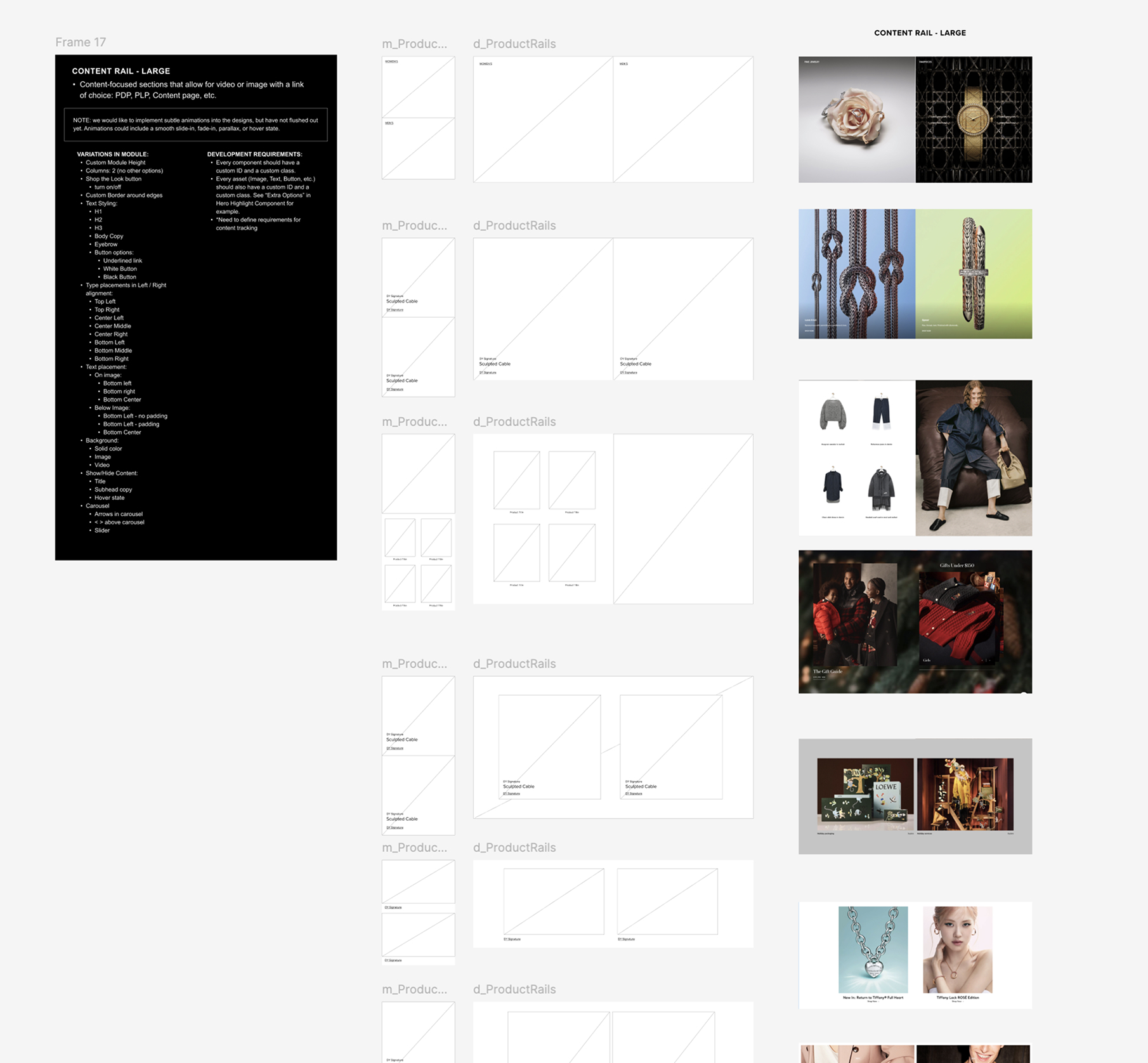
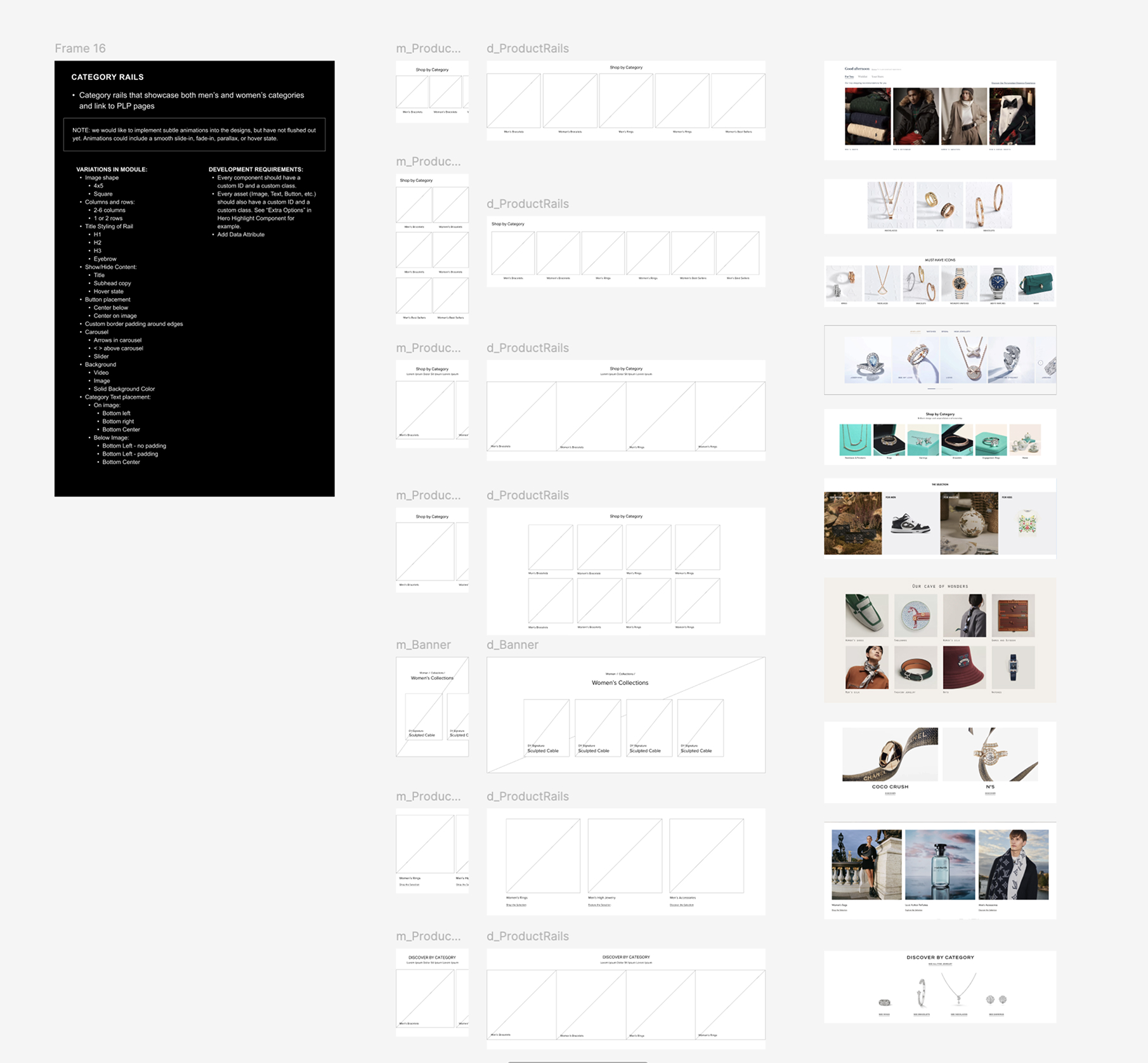
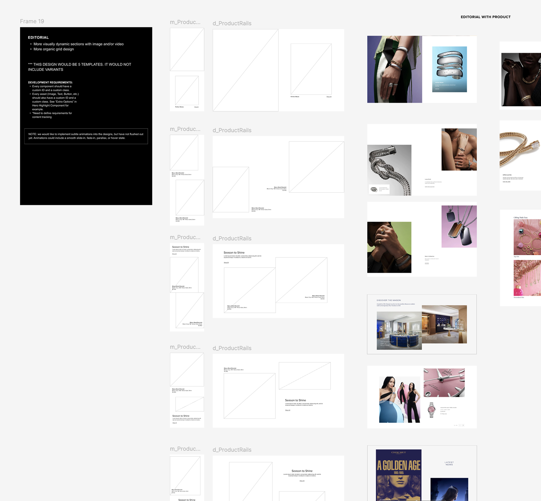
We took the competitive analysis and sythesized all the sections Creative would use the most and set out to build a system to work within those parameters.
The slideshow is a breakdown of how we built out the flexibility to test that our container method would work. We broke the screenshots into style groupings (Banner, Product Rail, Editorial, etc.) and then built requirements with wireframes alongside our development partner.
With this research and testing, we were able to see our hypothesis come to life: that our new module building method, using building blocks within containers, would work.
CHALLENGE 4
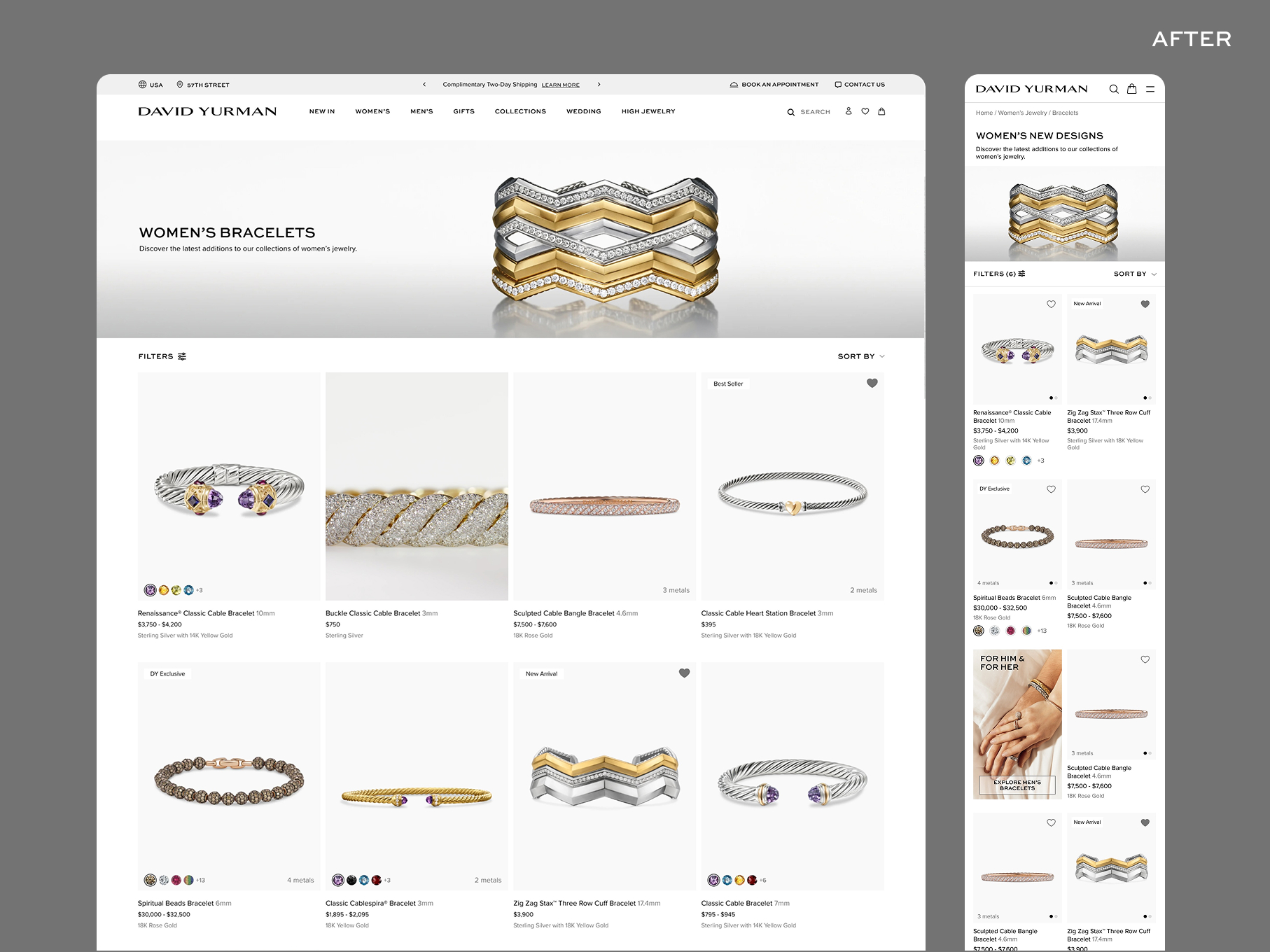
Pondering PLP: How do our users shop?
For the PLP redesign, we again went back to the data. We questioned how to cleanup the facets, what were users using the most, and how could we create a more visual experience with larger product cards but still allow for seamless search and filtering
We also found that "Quick View" was being used less than 1% of the time. We aligned to remove this button from the product cards to allow for more visual facets on top the product image and room for the incoming Virtual Try On callout.
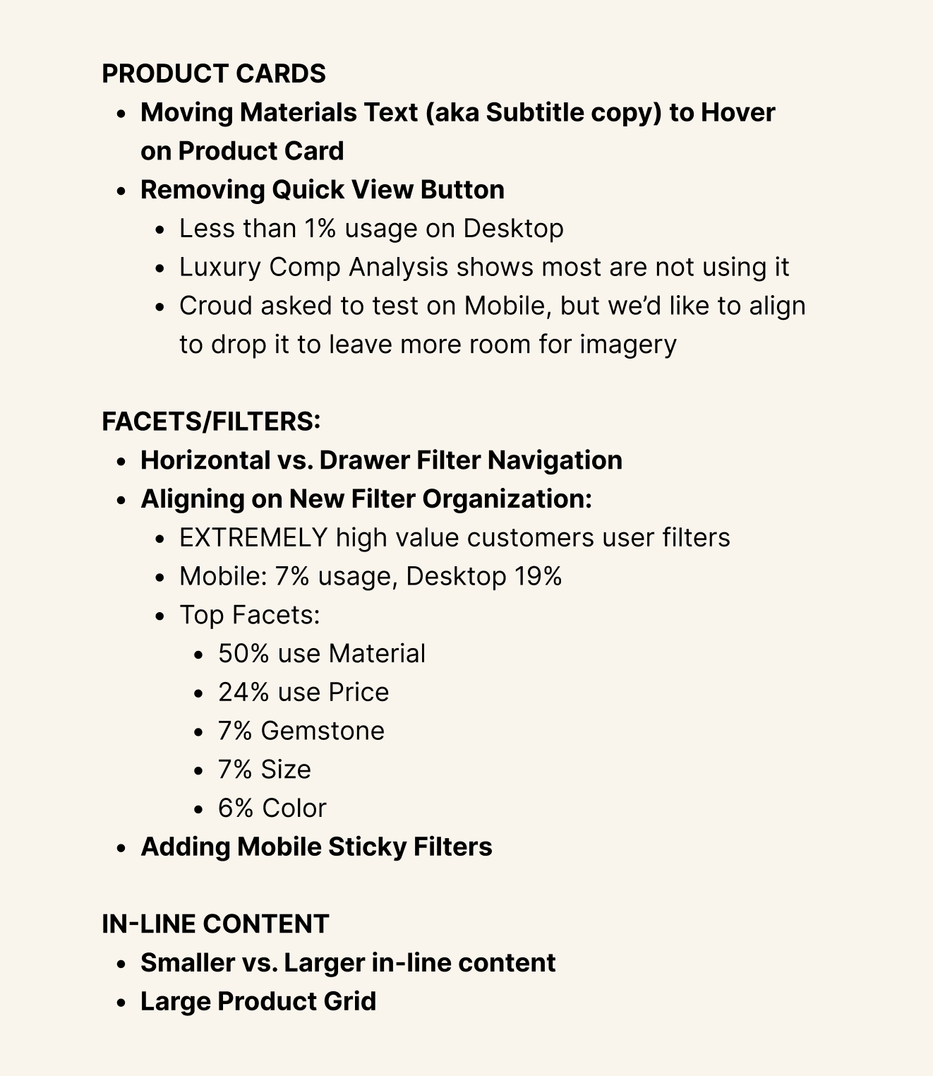
After receiving the data from our Data Analytics team, we saw that top facets included Materials, Price, Gemstone, Size and Color.
We also found that our most high value customers interacted with the filters, however, overall usage was low: 7% on Mobile and 19% on Desktop. This had us torn on whether to surface the facets or hide them in a drop-down or other hidden element to leave room for a more visual shopping experience.
We decided to run a UserTest to see how live interactions with the site worked, and it turned out 50/50 as well. The users had spoken.
So we came up with a way to have both. We added an open/close to our filters on PLP, allowing both styles of shopping to flourish. We set parameters around the facets as well, so that when users clicked through new pages or new categories, their preferences stayed. If the left the page with the facets closed, they'd land on another PLP with the facets closed. They chose their own prefernce and we supported it through the UX.
CHALLENGE 4
Presenting and aligning with Executive Leadership
One of the biggest pieces to the redesign was not only aligning cross-functionally, but aligning with the namesake of the company on how the future of their ecommerce site would look and feel.
I presented directly to Evan Yurman, the President and CEO of David Yurman, alongside the C-Suite team who would touch the site the most. Aligning with leadership along each leg of the process to make sure we were building a solid foundation. I presented our data, the vision for the future, and designs. They saw the vision for the site and I'm honored to have brought it to life.
THE OUTCOME
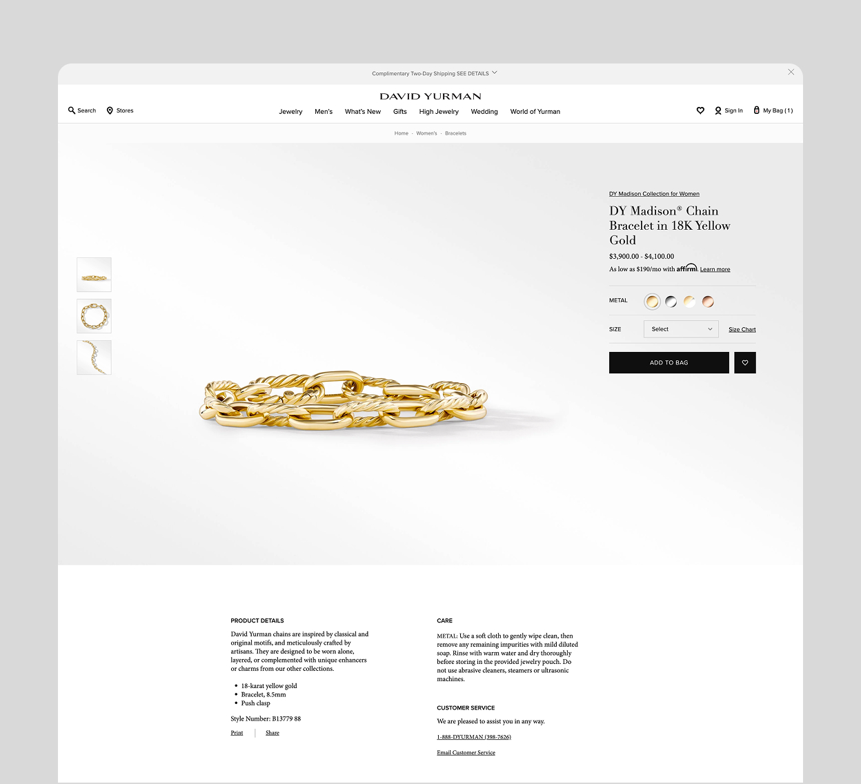
The redesign launched across homepage, cart, search, header, PLP, PDP, global navigation, and content pages throughout 2024 and 2025, contributing directly to the strongest ecommerce performance in the brand's history.
In 2024, net sales reached +23% YOY, exceeding plan by +8% and reforecast by +3%, with traffic growth of +34% YOY against a planned +10%. In 2025, the site exceeded total revenue goals, a +21.5% increase year over year and +1.2% to forecast, with bounce rate down -38%, time on site up +55%, pages viewed up +9%, and return rate down -21%.
REFLECTIONS
The thing I'm most proud of on this project isn't any single page — it's the fact that the redesign held together as a system.
Designing a live site page by page, in parallel with building the design system that would govern it, while presenting to C-suite leadership and aligning five cross-functional teams, is genuinely hard. The coherence of the result came from the discipline of thinking ahead and the practice of making every local decision with the global system in mind.
What I'd do differently: establish a more formal design decision log earlier in the process. As the redesign grew in scope and stakeholders multiplied, the reasoning behind early decisions became harder to trace. A lightweight decision record would have reduced repeated alignment conversations and made the handoff to the design system cleaner.
I'd also push for user research earlier in the prioritization phase — not just to validate designs, but to help sequence the redesign itself. Some of our most impactful findings came from testing pages we'd already spent significant time designing. Earlier research would have sharpened our sequencing and reduced rework.