Bringing fine jewelry to life in augmented reality.

ROLE
Lead UX
TIMEFRAME
2024-2025
CONTEXT
For a jewelry brand, the gap between an online product image and the physical experience of wearing a piece is enormous. A customer buying a $1,500 bracelet can't feel the weight, can't see how it sits on their wrist, can't judge scale against their own skin tone. That uncertainty has a cost — in abandoned carts, in returns, and in the customers who simply don't buy at all because they can't get confident enough to commit.
David Yurman's stores offer something no product photo can replicate: a trained associate, a mirror, and the piece itself. The business challenge was to close that gap for the growing segment of customers who would never walk into a store — and do it in a way that felt like an extension of the brand's standards, not a compromise of them.
Outcome & Metrics
Virtual Try-On launched on bracelets in 2025. Within its first year of operation, the feature drove $15M in incremental sales, attributed directly to customers who used the VTO.
+$15M
Additional Revenue Generated for 2025 vs. non-VTO users
+14.08%
Average Order Value
+39.94%
Revenue Per Session
+22.85%
Conversion Rate
THE PROBLEM
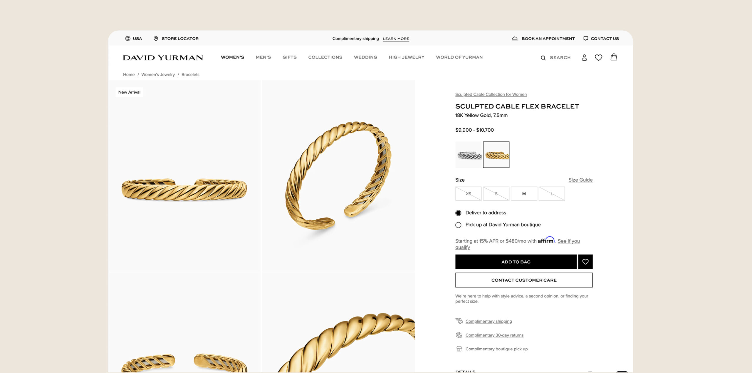
The business framed this as a conversion and returns problem. That was accurate, but it was also a trust problem and a brand problem. A low-fidelity AR experience — one where the jewelry looked flat, plastic, or dimensionally wrong — would do more damage than no AR at all. For a customer with high expectations, an unconvincing try-on doesn't just fail to help. It makes the product look worse than a good photograph.
The design challenge had two layers: build an interaction that was intuitive enough to actually get used, and build an AR rendering accurate enough to be trusted. Both had to be true for the feature to work.
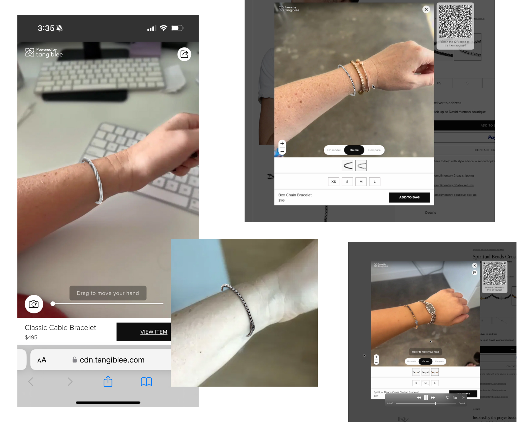
RESEARCH & PLANNING PHOTOS
MY ROLE & CONSTRAINTS
I led the end-to-end design of the Virtual Try-On experience — overseeing UI design in collaboration with our AR vendor, owning the full user flow from PDP entry through the try-on interaction, designing the onboarding experience, and art directing the AR rendering itself.
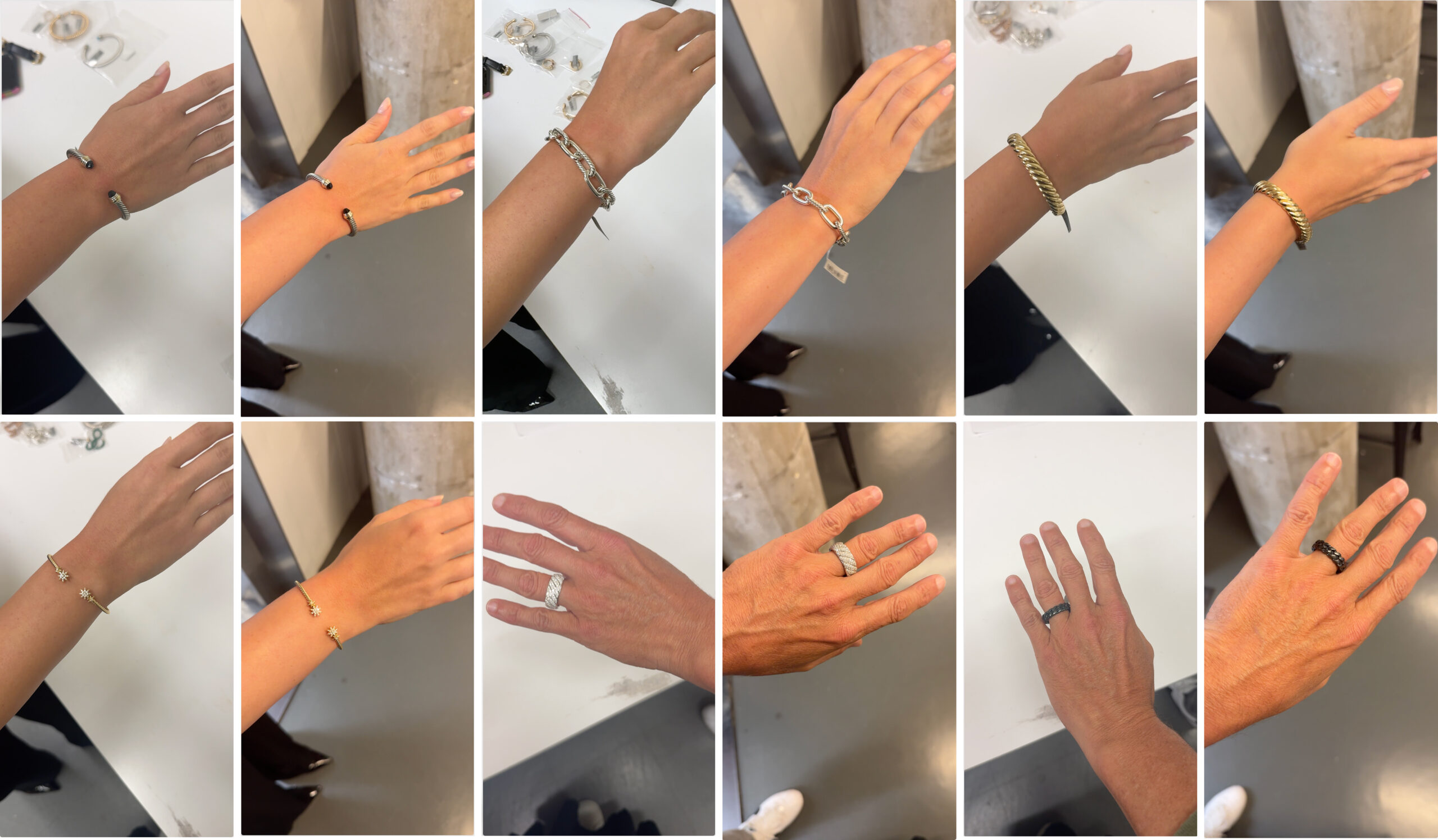
That last piece was the longest and most technically demanding part of the project. Getting the AR jewelry to look real required months of iterative feedback on metal sheen, shadow behavior, color accuracy, and dimensional scale. I sourced and reviewed over 50 archival videos of David Yurman pieces on model to establish the visual reference standard, then worked through the vendor's rendering pipeline to close the gap between what the technology could produce and what the brand required.
Constraints: the AR vendor set the technical ceiling on what was renderable. My job was to push that ceiling as far as it would go while staying within what could actually ship — and to design an experience around it that would hold up to a customer who had just spent time in a David Yurman flagship.
KEY DECISION 1
Treating the rendering as a design problem, not a vendor problem
The default vendor output was technically functional but visually unconvincing — the metal lacked depth, shadows were flat, and scale felt slightly off. Rather than accepting this as a technical limitation, I treated it as a design problem I owned. I sourced our archival model footage as reference, identified the specific visual variables that were creating the disconnect, and worked through the feedback cycle systematically until the output met the brand standard. This took months but was the difference between a feature customers would trust and one they'd use once and dismiss.
THE SOLVE
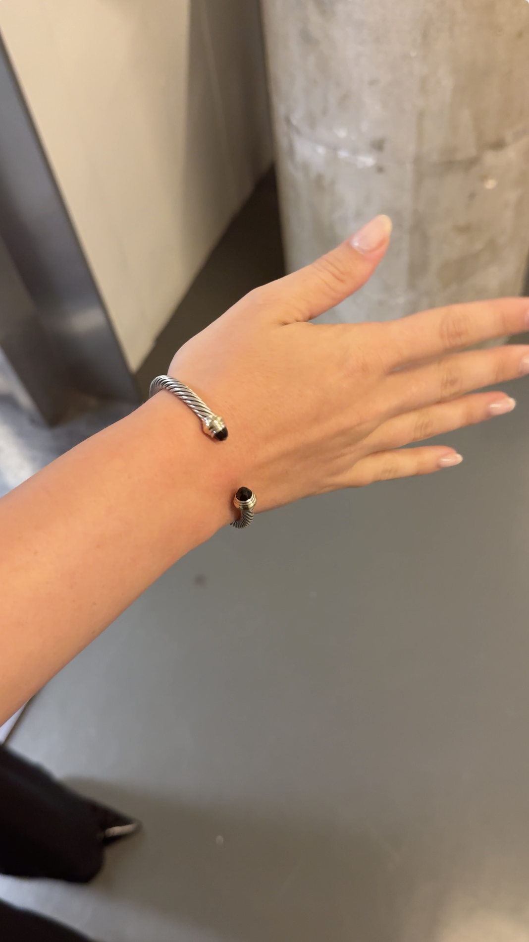
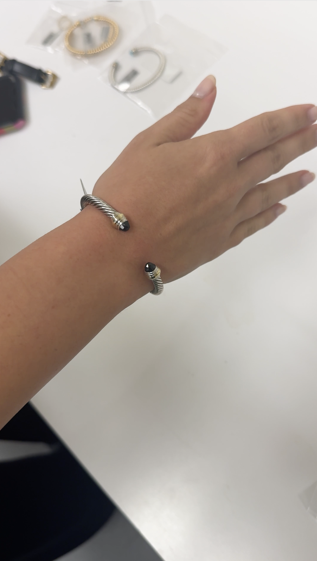
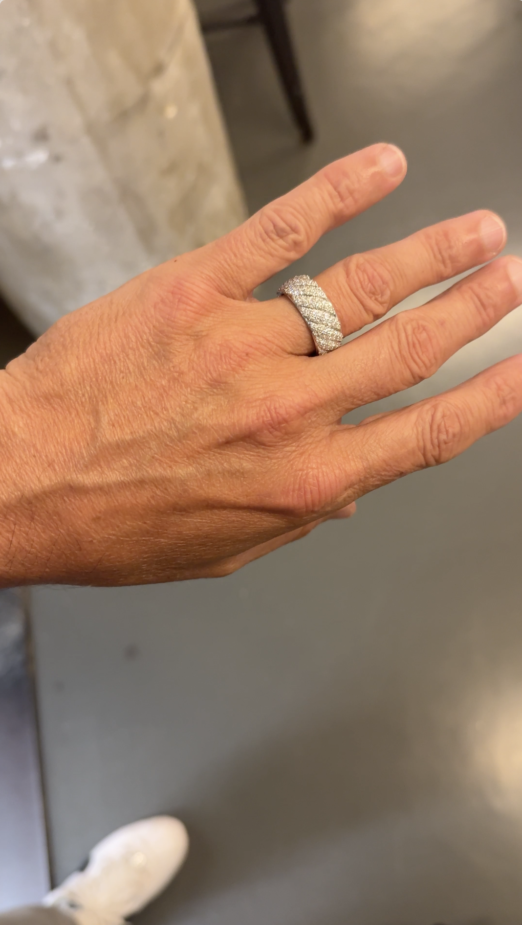
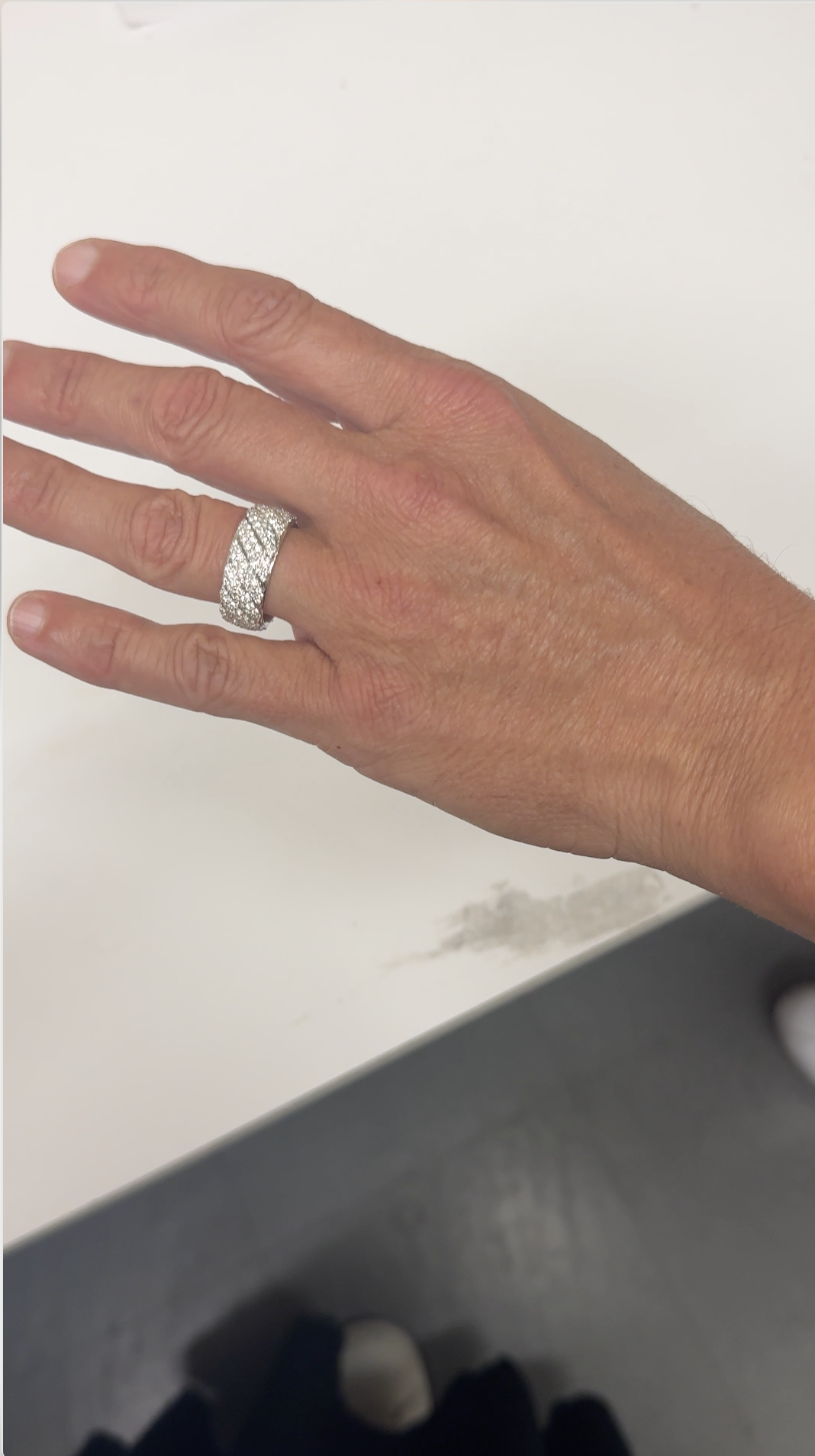
Rather than accepting this as a technical limitation, I treated it as a design problem. I led the David Yurman QA and UX teams to create on model reference videos in two different lightings, identified the specific visual variables that were creating the disconnect, and worked through the feedback cycle systematically until the output met the brand standard. This became the difference between a feature customers would trust and the defining luxury experience we were designing for.
This library became the refrence library for the metal and style catalog for the vendor, helping them develop for sheen, coloring and lighting differences in warm and cool light.
KEY DECISION 2
Designing the onboarding to remove friction, not add it
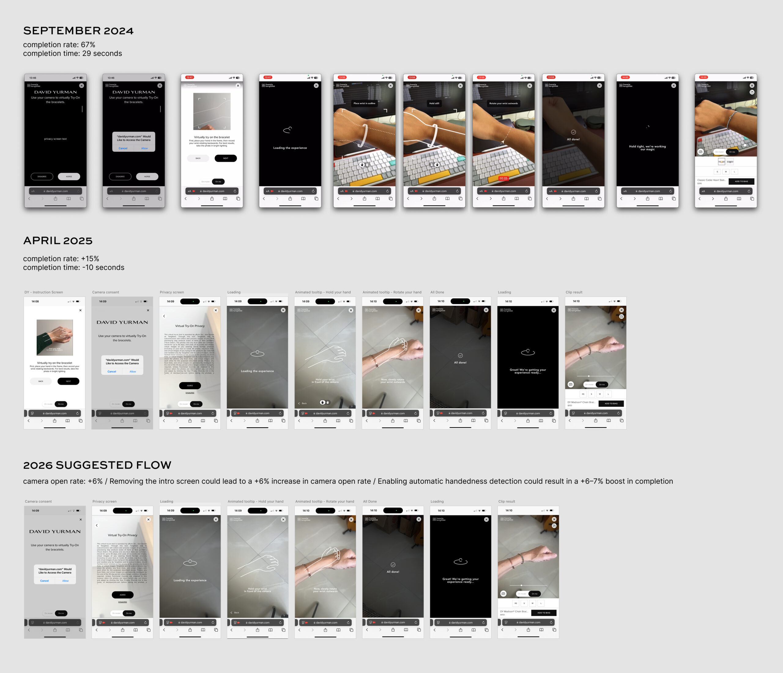
AR try-on features frequently fail at the entry point. Complicated permissions flows, unclear instructions, and too many steps before the customer sees anything. In partnership with Tangiblee, I designed the onboarding to be minimal and momentum-building: get the customer to a live try-on moment as fast as possible, with just enough guidance to make it work.
Through three major iterations, we landed on a simplified version that resulted in higher completion rates and times, and overall smoother experience for the user.
KEY DECISION 3
Integrating the experience into PDP without disrupting the purchase flow
The VTO entry point needed to live naturally within the product detail page without competing with the primary purchase path. I designed the button placement, labeling, and visual treatment to invite use without creating confusion about where to go to actually buy. This required close coordination with the broader PDP design to ensure the feature felt additive rather than distracting.
THE OUTCOME
The Design System launched in 2026 after a year of designing and developing the assets. It was then deemed the foundational infrastructure for all digital design work going forward across our CMO organization.
It was adopted across the site, email, and outside vendor projects like our Clienteling tool, and served as the compliance and consistency baseline. We created onboarding documentation, workflows for component updates, and a Vendor-specific version that used select pages and key information needed to communicate brand needs.
REFLECTIONS
The thing I'd tell any designer going into an AR project: the rendering is the UX. I spent months in feedback cycles on metal sheen, shadow behavior, and dimensional accuracy — and every one of those cycles was worth it, because a try-on that looks slightly wrong destroys trust faster than no try-on at all. The art direction work was the highest-leverage thing I did on this project, and I'd protect that time in any future scope negotiation.
What I'd do differently: establish a visual fidelity benchmark and formal sign-off process with the vendor at the project's start rather than developing it iteratively. Defining "what good looks like" in concrete, testable terms before the first render ships would have compressed the timeline significantly. I'd also bring real customers into the rendering phase earlier — internal judgment is valuable, but user trust signals on early renders would have given us something to act on sooner.