Making clean beauty's complexity feel intuitive.

WHERE
CASE Agency
ROLE
Lead UX Designer
CONTEXT
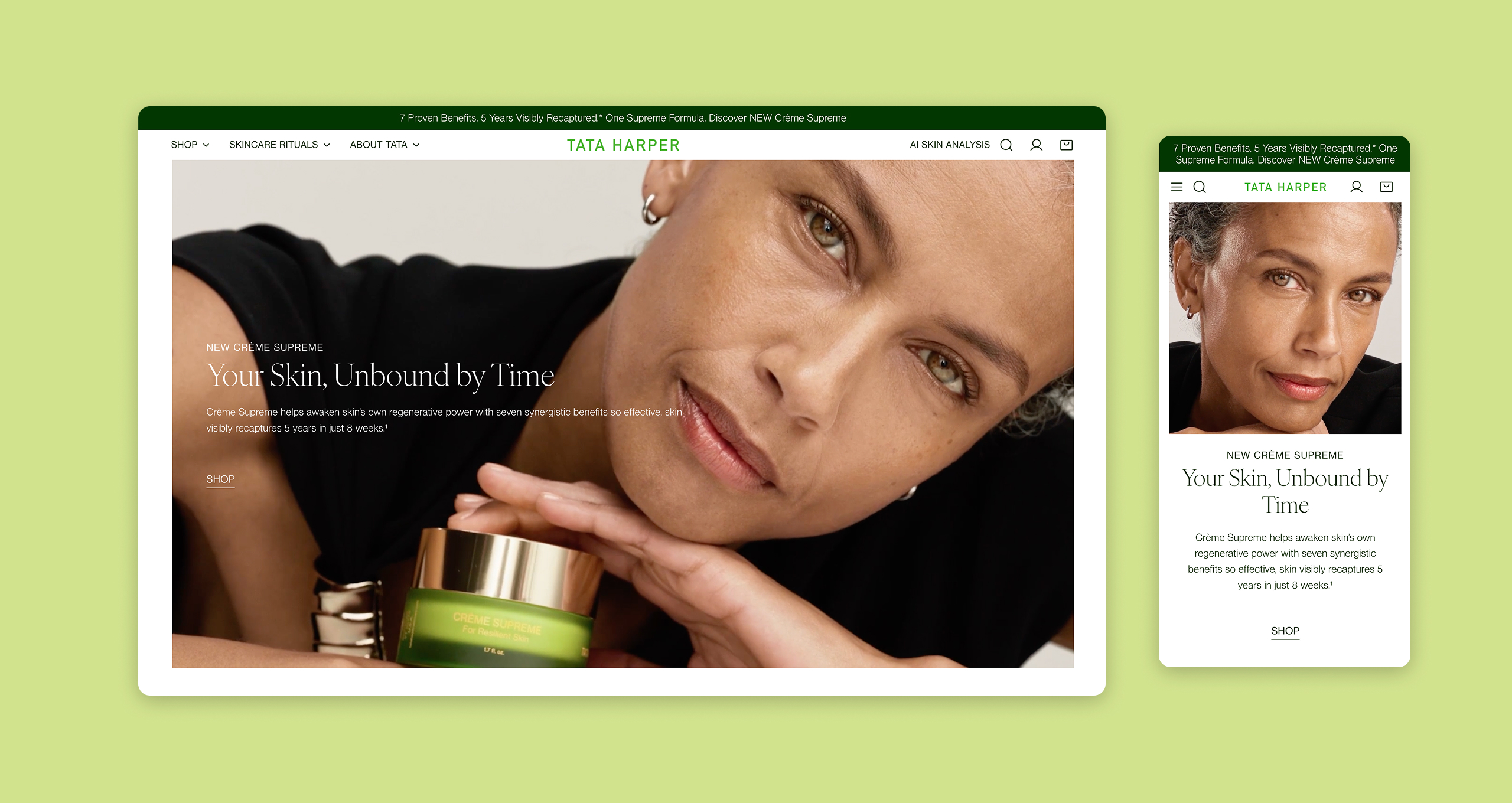
Tata Harper built its reputation on clean, high-performance skincare rooted in real ingredients grown on a Vermont farm. The brand's in-store and workshop experience was deeply personal — skin analysis, custom product recommendations, the kind of high-touch interaction that made customers feel genuinely cared for.
The ecommerce site hadn't caught up. It was a transactional experience for a brand that was anything but. The redesign brief was ambitious: create a digital destination that could replicate the intelligence and warmth of the in-person Tata Harper experience — at scale, for every customer who would never set foot in a workshop.

PROBLEM
The core design challenge was a translation problem. How do you take a sensory, relationship-driven skincare experience — one built on expert guidance, ingredient storytelling, and personalized recommendations — and make it work for a customer browsing alone on a phone at midnight?
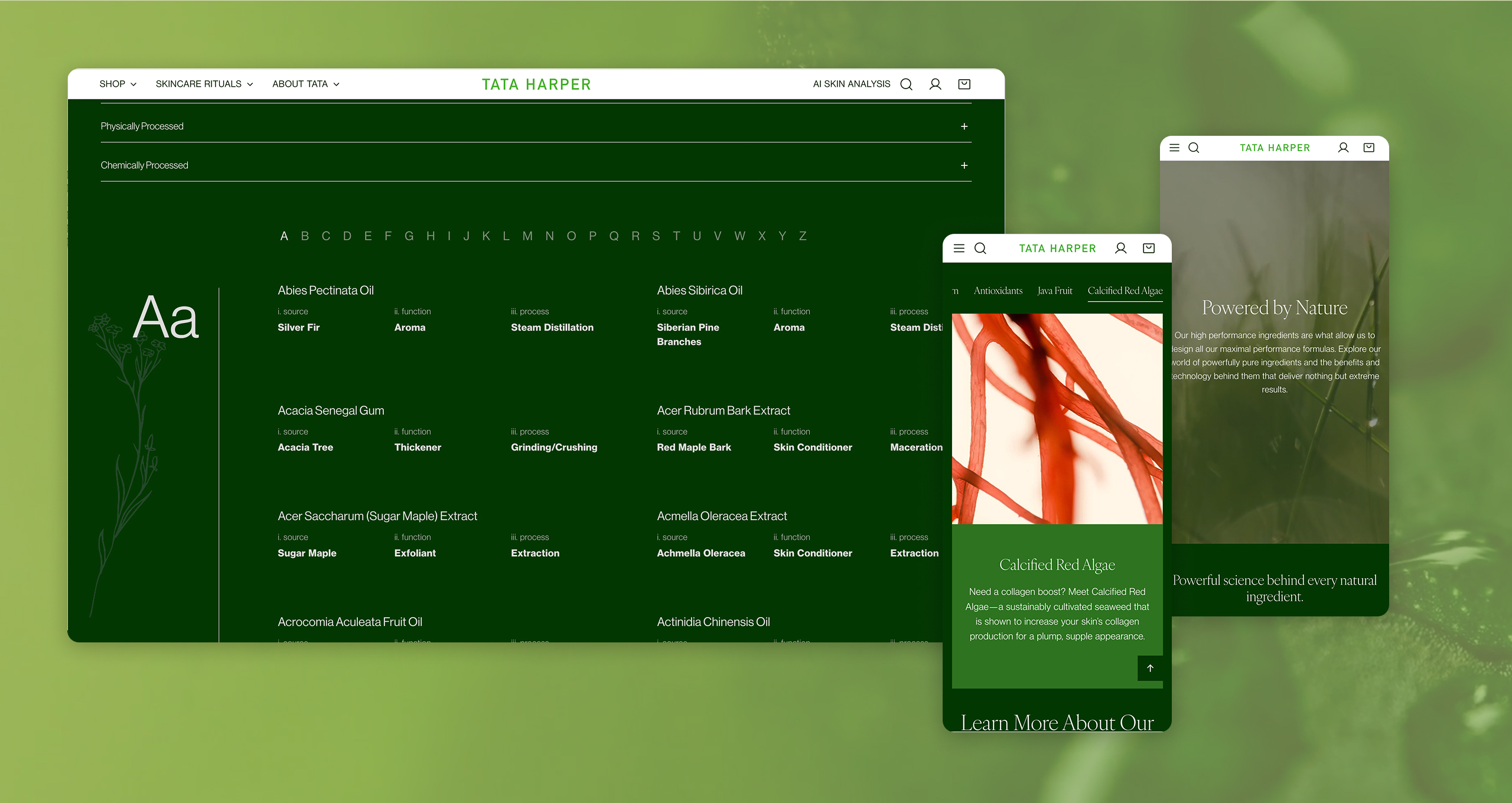
The ingredient dictionary was central to this. Tata Harper's formulas were the product's most compelling differentiator, but that information was dense, technical, and scattered. Making it discoverable, digestible, and woven into the purchase journey required rethinking not just individual pages but the entire information architecture of the site.
MY ROLE AND CONSTRAINTS
I served as UX Design Lead, owning the research, site architecture, user flows, and experience strategy. I worked alongside CASE's strategy and research teams to develop four core strategic pillars — Philosophy, Elevate, Performance, and Way of Life — that structured the approach to the redesign, then led the translation of that strategy into wireframes and experience frameworks.
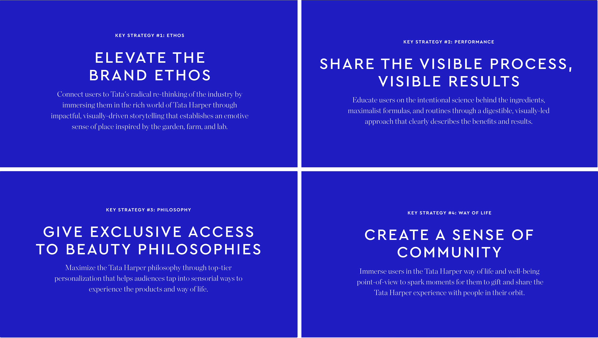
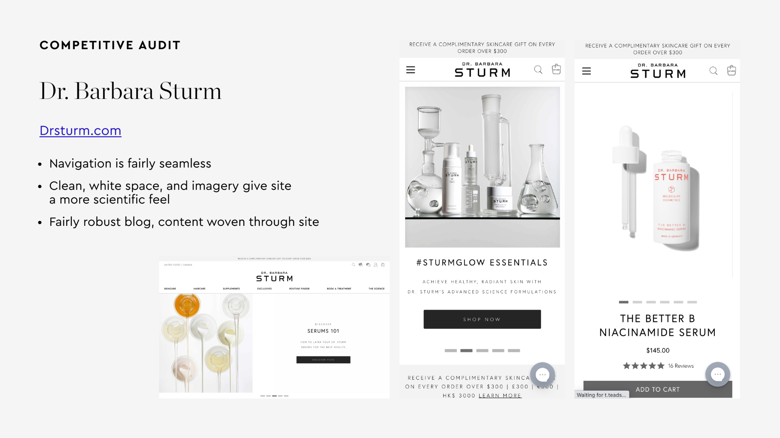
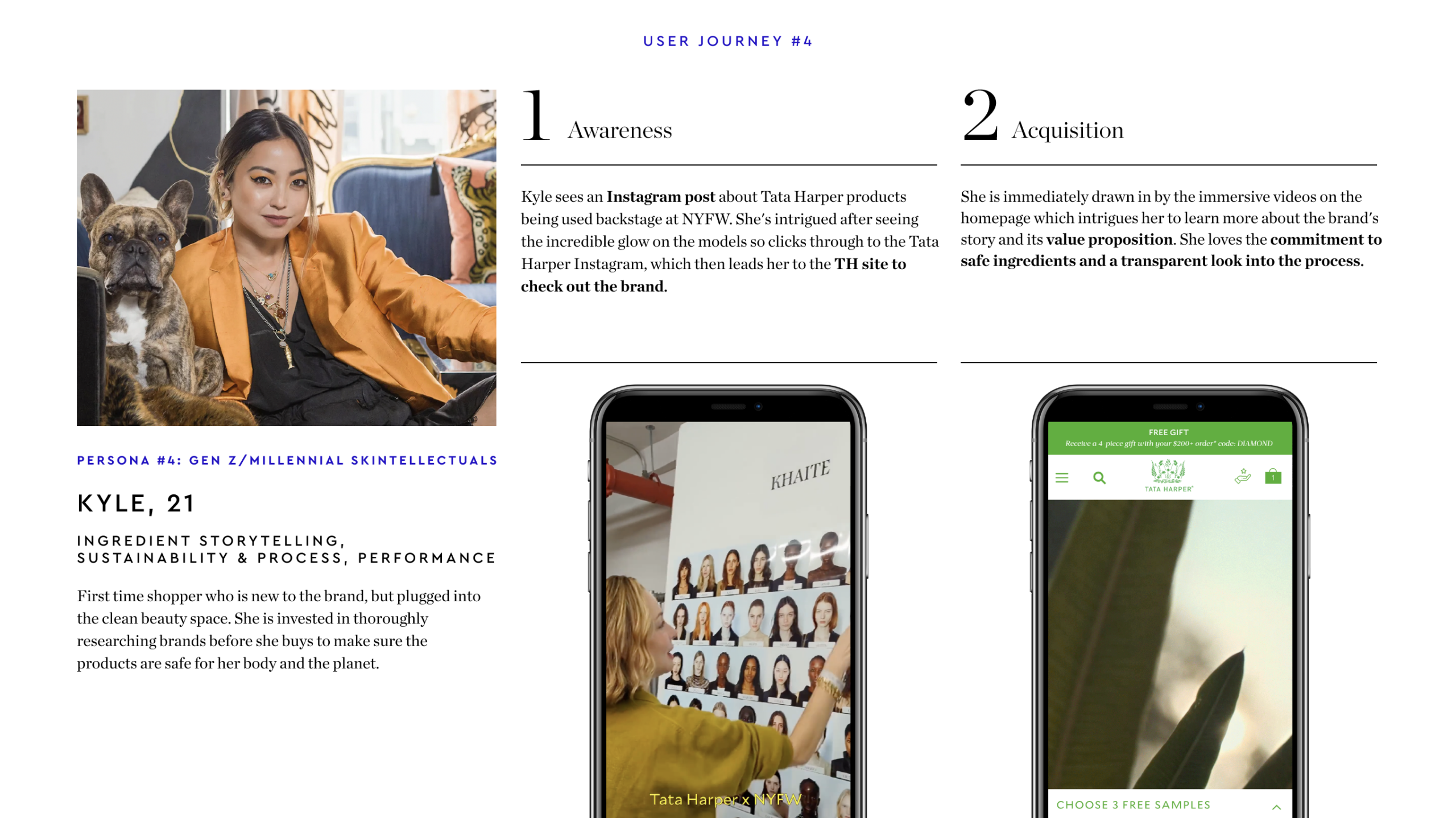
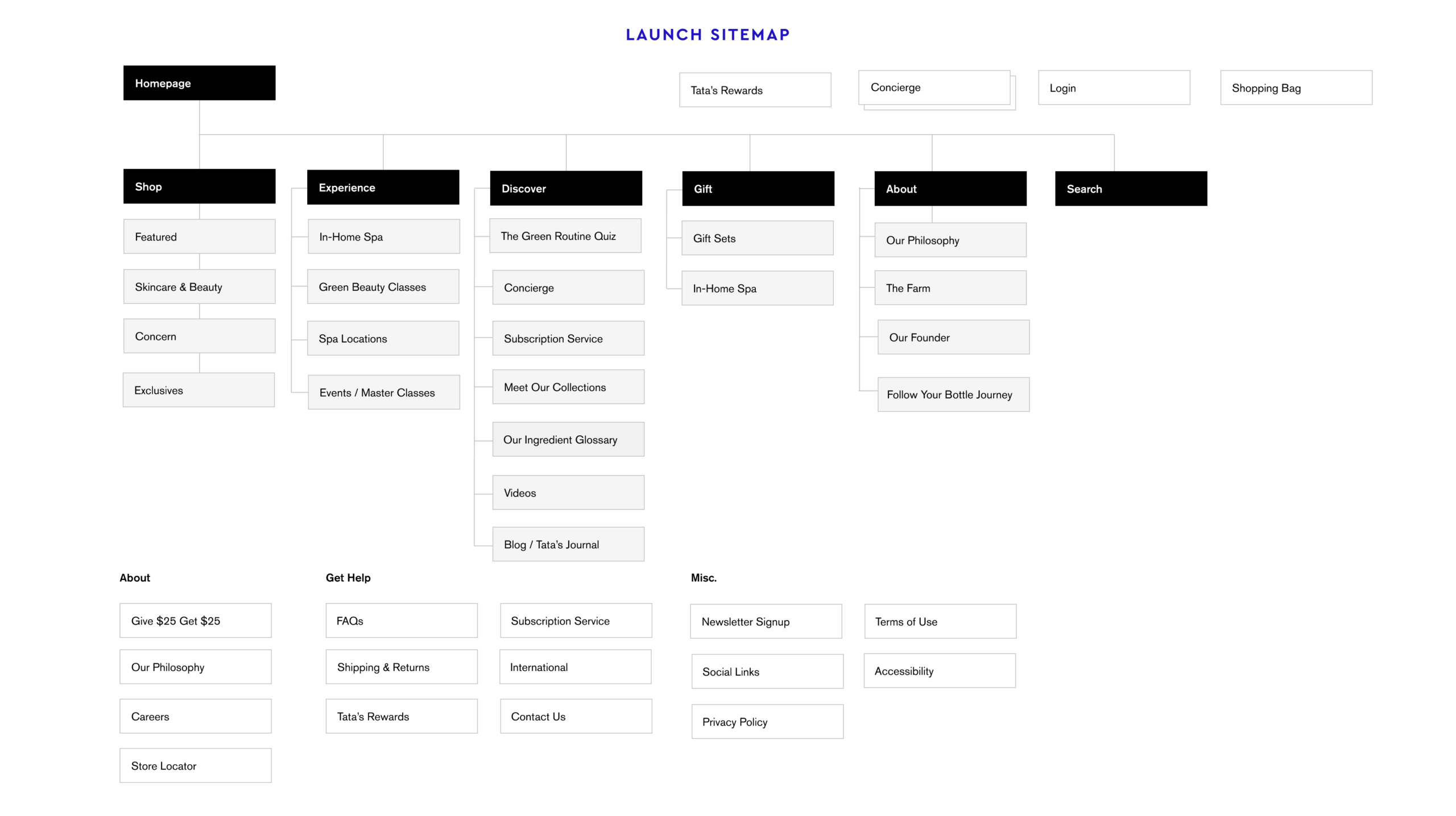
Competitive Analysis, Customer Profiles, and Site Map
KEY DECISIONS
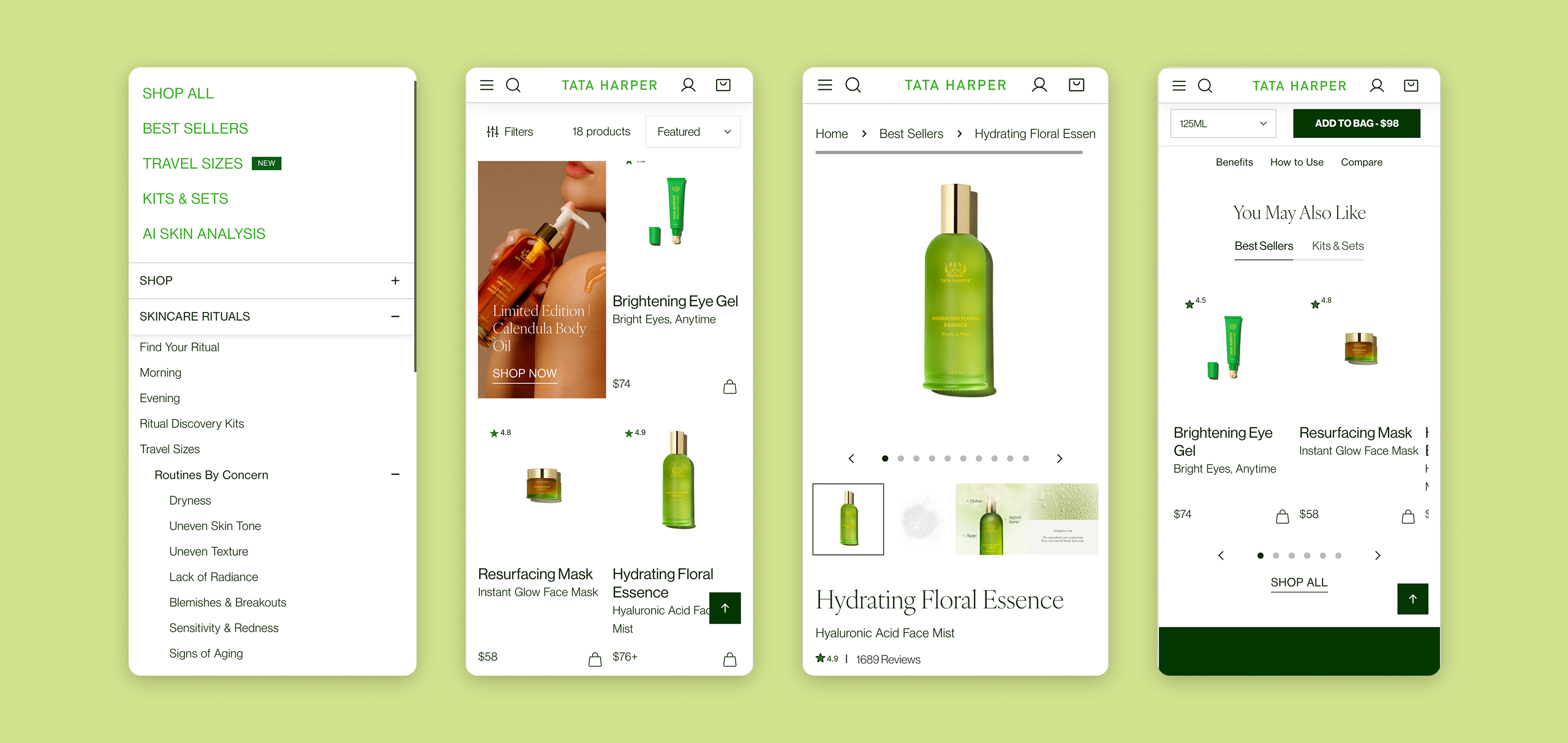
Based on the company's site themes, I made key decisions on the path for the site flow and wireframes. These are a few highlights of the pivotal moments of the project.
KEY DECISION 1
Reimagining PDP as a deep storytelling opportunity
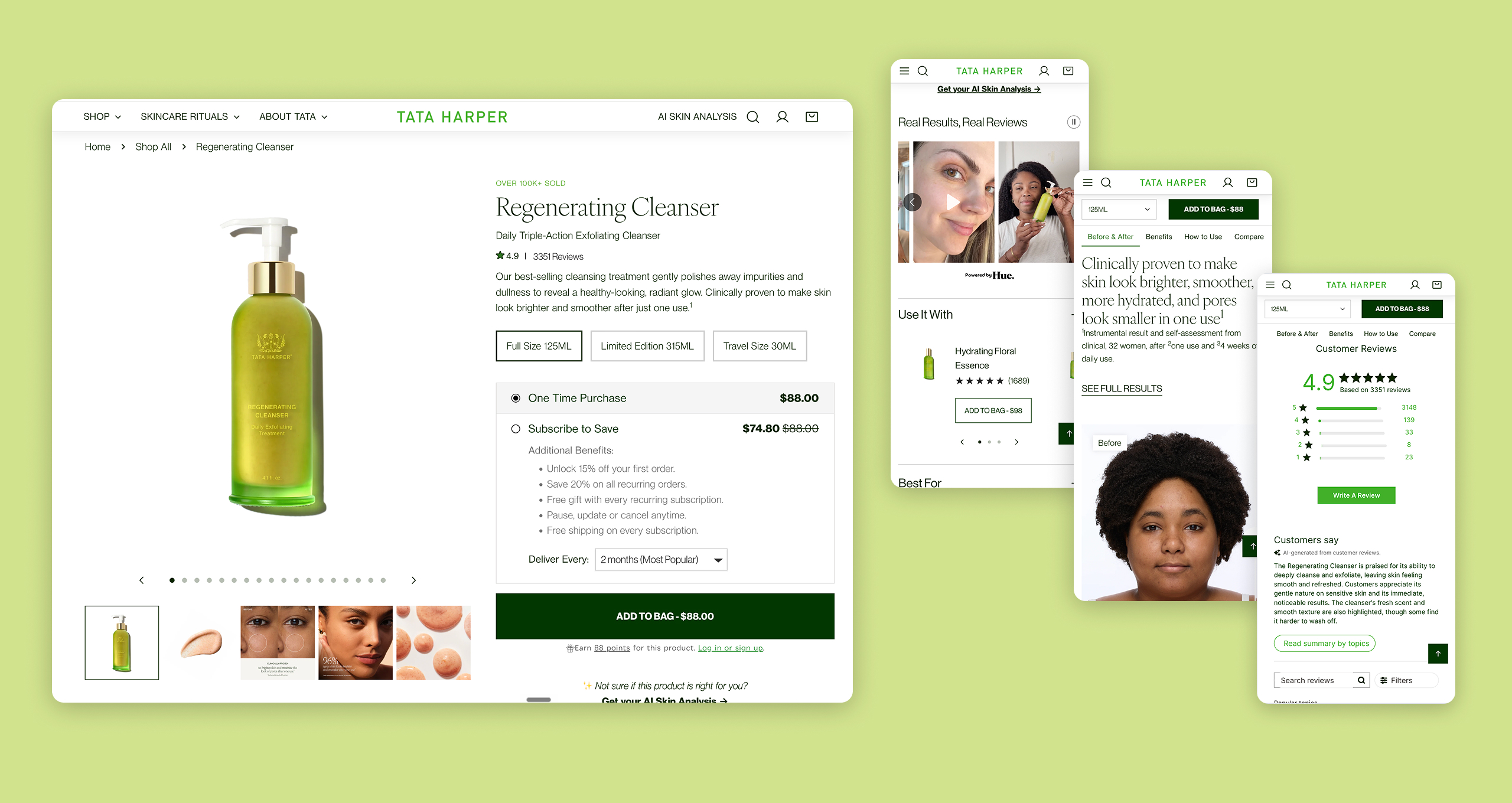
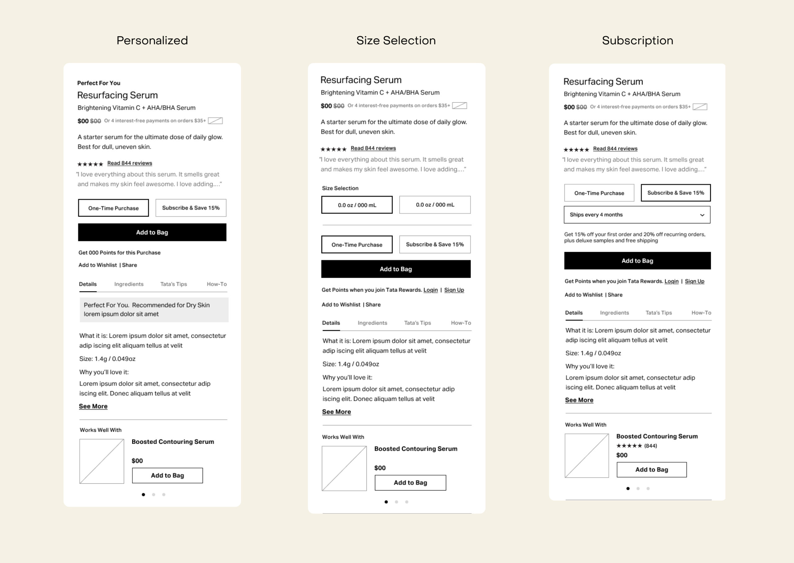
The four redesign strategies could easily have become four siloed sections. I designed the site architecture so that each pillar was woven through the entire experience rather than housed in its own destination. A customer shopping a serum would encounter the brand philosophy, the ingredient science, and the community story as part of that journey — not by navigating to separate pages.
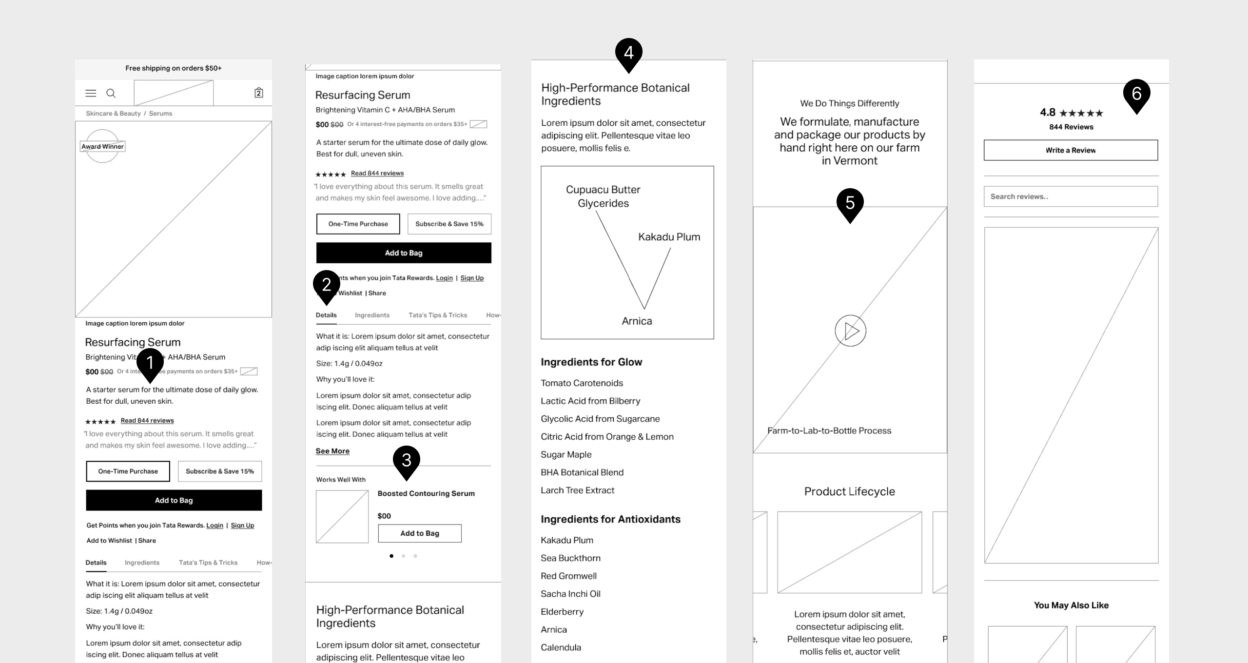
FIG. 1
Tata's product descriptions were rich with content, but to avoid the user getting lost, we created a 1-line description to appear first and a deeper detailed description after the Add To Bag button for deeper learning.
FIG. 2
We ran into issues keeping the top of the page simple due to the amount of copy, so we added tabbed content to expand on storytelling and keep the section as minimal as possible.
FIG. 3
Tata's products are often bought in pairs or collections for best results, so we added a "Works Well With" section to cross-promote complimentary products.
FIG. 4
Each product is a special combination of ingredients, scientifically backed. We created a section for science to be at the forefront, outlining how each ingredient works within the project.
FIG. 5
A signature of Tata Harper's products is the tracking of their lifecycle, marked on each bottle. We made room on the PDP to show this, highlighting quality and process.
FIG. 6
Reviews were key for the brand and we added a section to highlight feedback in the second half of the page.
KEY DECISION 2
Designing the skin analysis experience as a digital journey, not a quiz
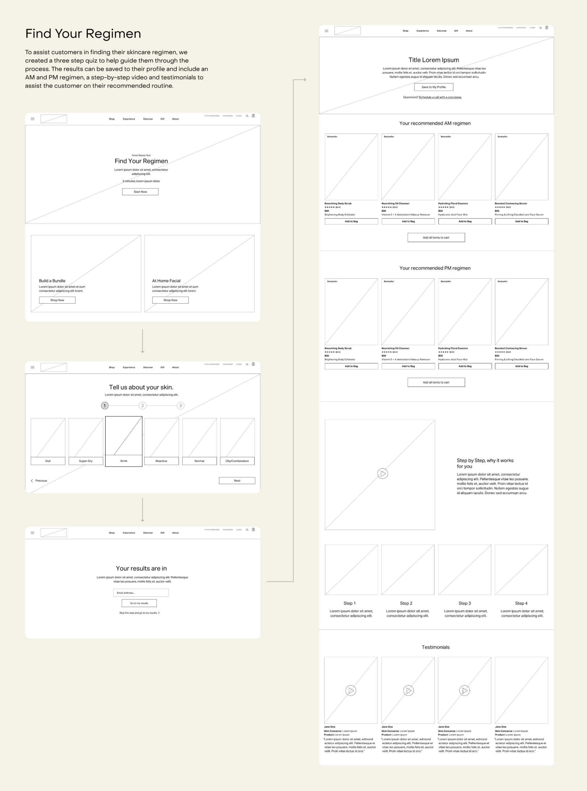
Tata Harper's in-person skin analysis was a relationship-building moment. A generic skincare quiz is not. I designed the digital equivalent to feel guided and responsive — a structured journey that gathered the right information while giving the customer a sense that the experience was adapting to them, not processing them.
KEY DECISION 3
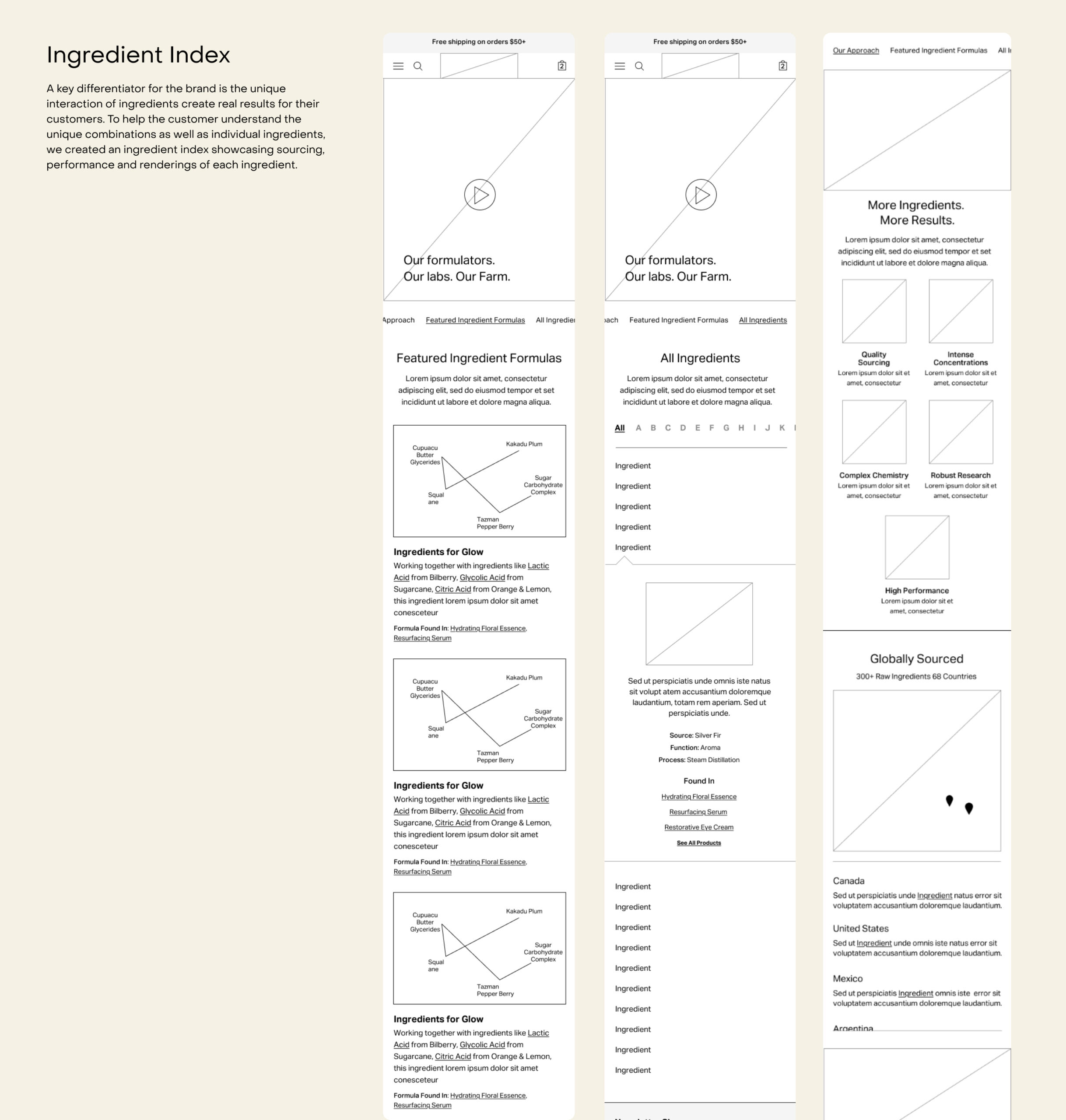
Building the ingredient dictionary as a navigation system, not a reference page
The brief called for an ingredient database, but a database is a dead end — you have to know what you're looking for to use it. I reframed it as a discovery tool: an ingredient-first navigation layer that let customers explore products through the lens of what was in them. This turned a content asset into a conversion path.
OUTCOME
The Tata Harper redesign established a new digital standard for how a clean beauty brand could bring its in-person expertise online, turning the ingredient story and the skin analysis experience into core parts of the ecommerce journey.
The site launched as one of the most editorially rich and experience-driven destinations in the clean beauty category.